
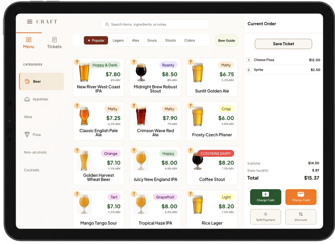
Craft POS
• UX Research • Product Design • UI Design • Branding • Prototyping
What if a POS could prevent mistakes before they happen?
Drawing from my background in education and hospitality, I designed Craft to make complex workflows easier to learn. Usability testing resulted in 93.8% independent task completion rate while improving clarity across allergy management, beer information, and customer tab identification.
PROJECT: Bootcamp End-to-End Application
ROLO: Solo UX / UI Designer
TOOLS: Figma
TIMELINE: 90 Hours
A quick snapshot
The Question
How can a POS guide bartenders, not just process orders?
The Solution
Designed Craft, an intuitive POS experience that simplifies high-pressure tasks and helps bartenders prevent common errors.
The Outcome
Usability testing validated clearer workflows for allergy management, beer information, and customer tab identification
100%
Overall Task Completion Rate
7 years
average hospitality experience among participants who tested Craft.
5/5
average participant rating indicating strong intent to use Craft in daily service operations
Learning from Competition


I conducted a competitive analysis of Square, Toast, and Clover to understand how established POS platforms approached common workflows. I found that users valued simple, intuitive interfaces, but existing systems could become complicated when employees needed to search for information or complete less common tasks.
⚙️ Core Capabilities
• All platforms offer payment processing, business reporting, and employee management
• Cloud-based access and third-party integrations are standard features
• Hardware solutions and customer engagement tools are table stakes
📚 Key Learnings
• Industry specialization beats general solutions for competitive advantage
• Simplicity drives adoption while flexibility supports diverse business needs
• Strong ecosystems increase customer retention through integrated platforms
🏢 Company Differences
• Toast specializes in restaurants with deep hospitality focus but costs more
• Square prioritizes simplicity and affordability for small businesses across industries
• Clover emphasizes customization and flexibility through extensive app marketplace
I began by interviewing five hospitality professionals to understand how employees use POS systems during actual service. Participants had experience working in breweries, bars, and restaurants and regularly interacted with POS systems while managing multiple responsibilities.
Rather than asking users what features they wanted, I asked them to walk me through their existing workflows. We discussed opening and closing tabs, adding and modifying orders, processing payments, searching transactions, and the challenges that arise during high-volume shifts.
User Research Uncovered the Biggest Friction Points in Busy POS Workflows
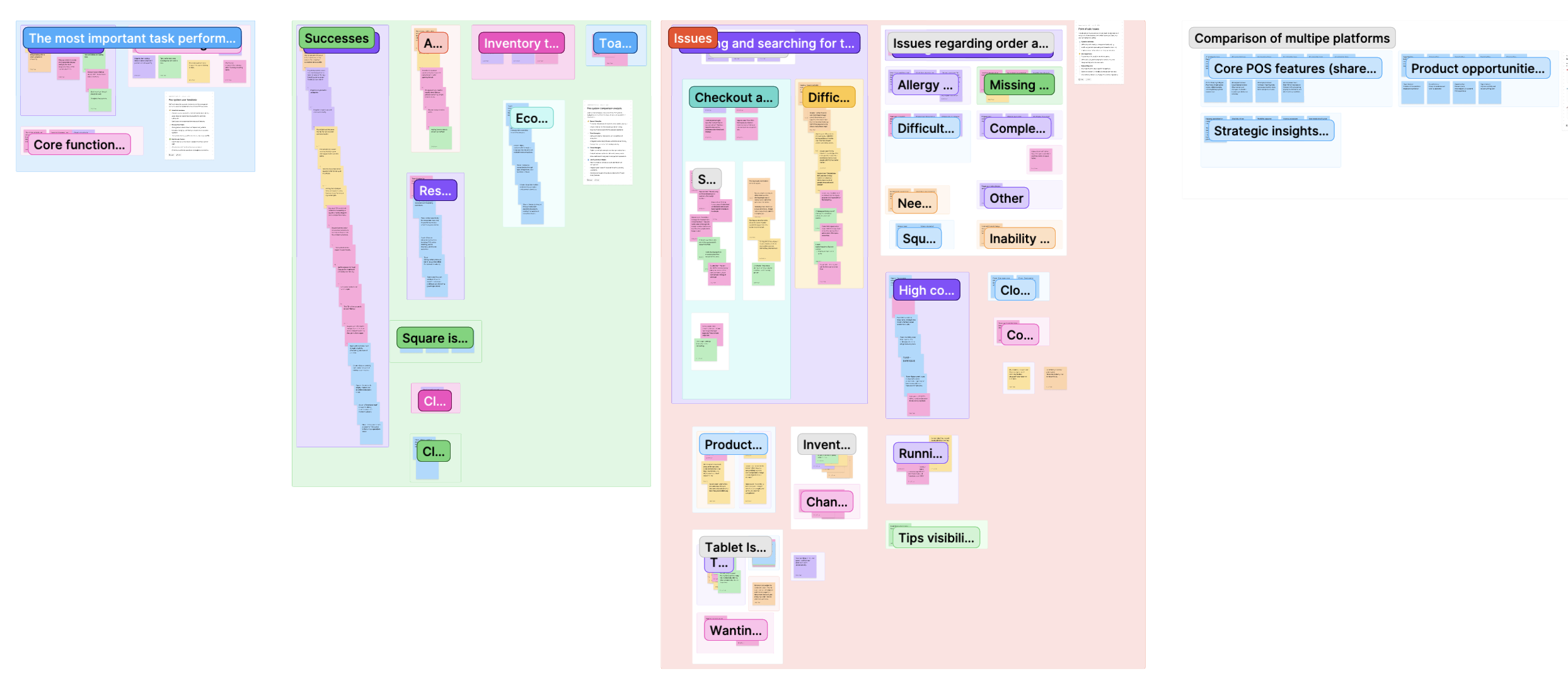
I began by interviewing five hospitality professionals to understand how employees use POS systems during actual service. Participants had experience working in breweries, bars, and restaurants and regularly interacted with POS systems while managing multiple responsibilities.
Rather than asking users what features they wanted, I asked them to walk me through their existing workflows. We discussed opening and closing tabs, adding and modifying orders, processing payments, searching transactions, and the challenges that arise during high-volume shifts.
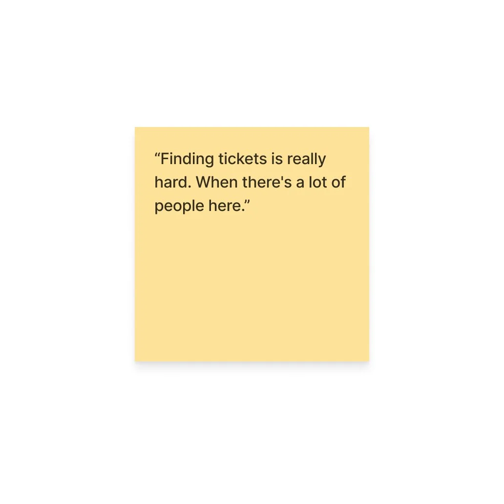
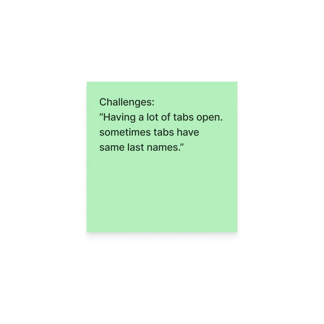
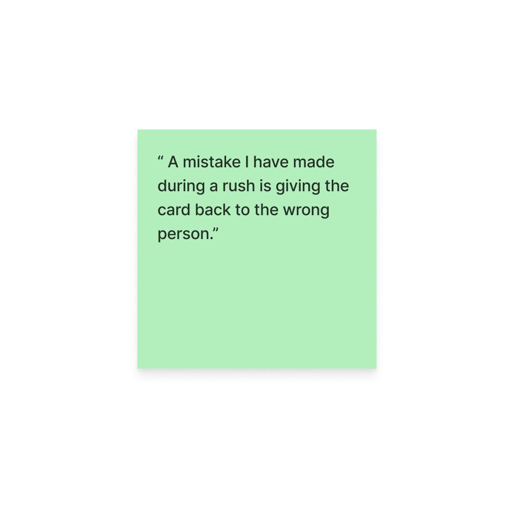
One of the strongest patterns was that tasks that felt relatively simple during slower periods became much more difficult when employees were multitasking. Participants described struggling to locate customer tabs, searching through previous transactions, accidentally adding items to the wrong order, and losing time correcting mistakes.
Key research findings
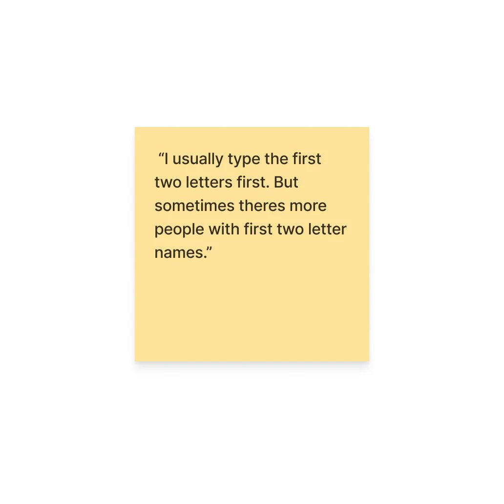
Finding tabs took too long.
Employees frequently managed several open tabs at once. Similar customer names made it especially easy to select or close the wrong tab.
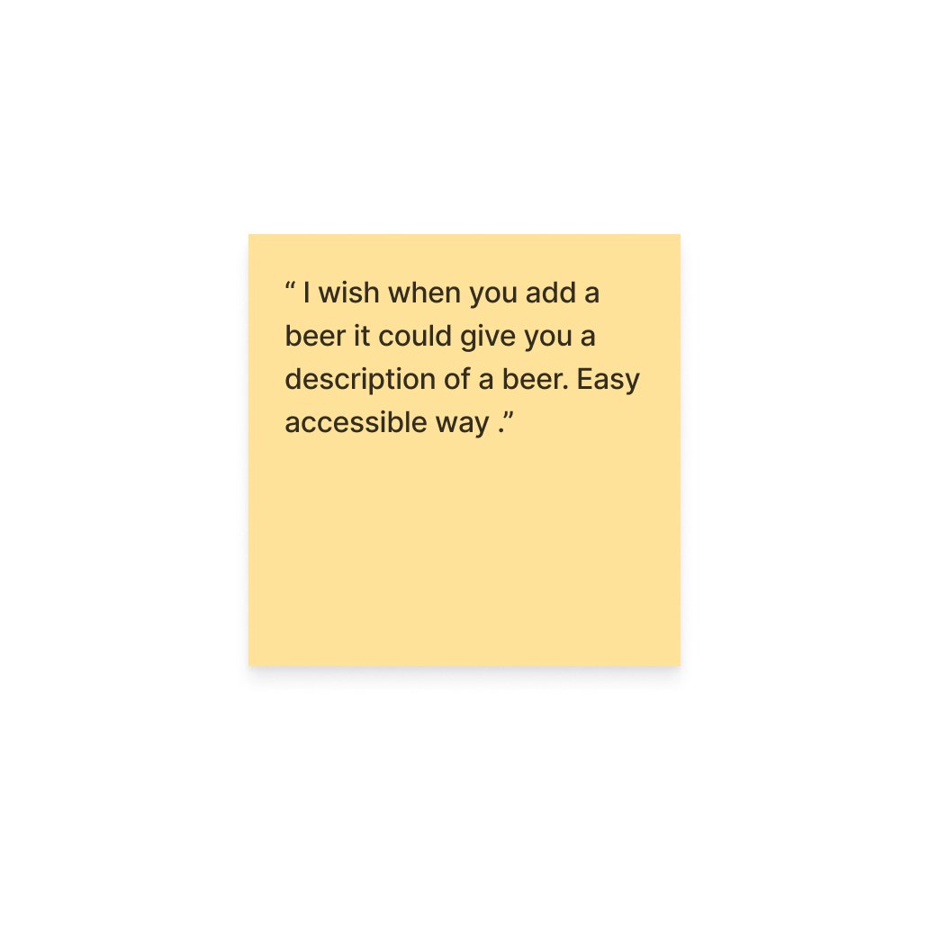
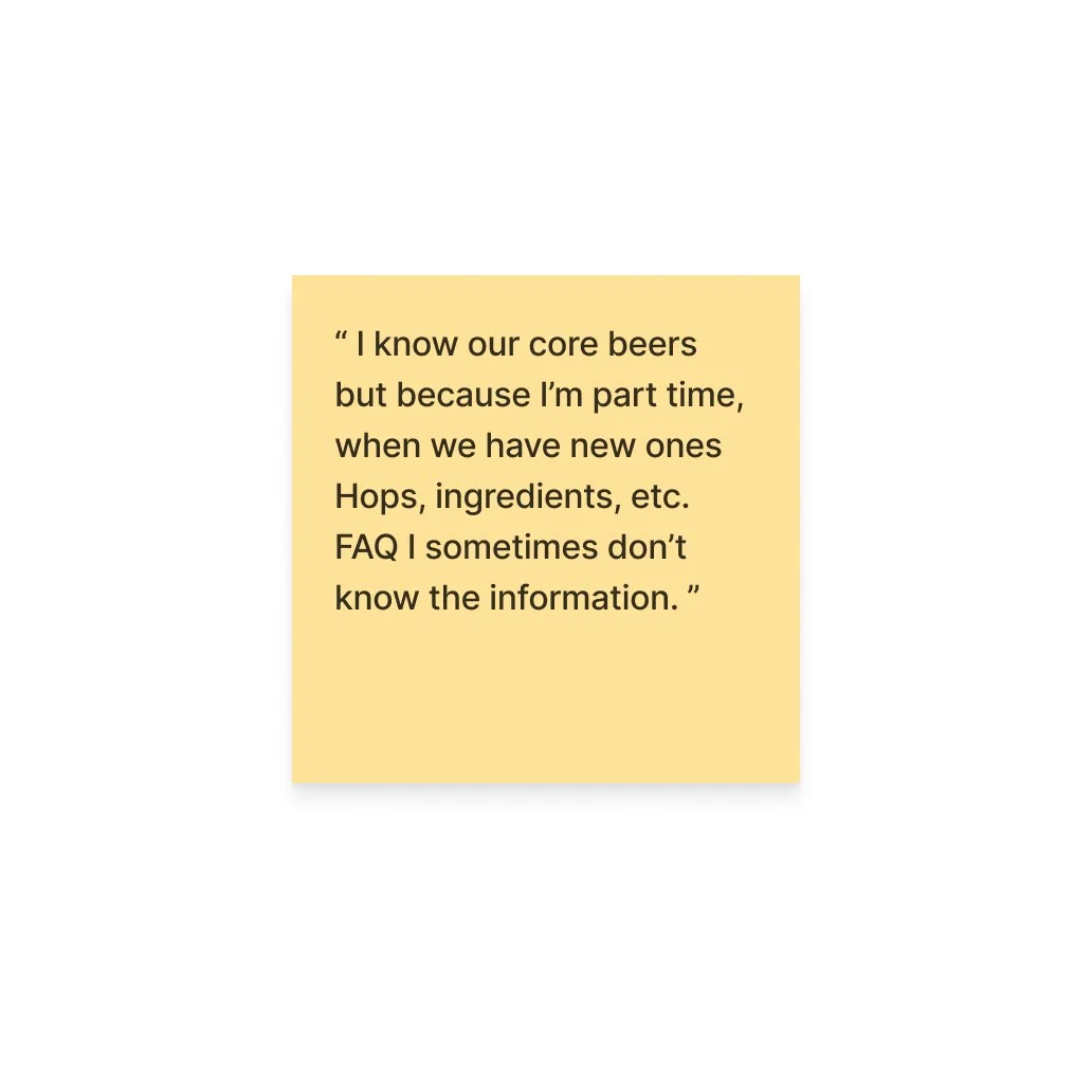
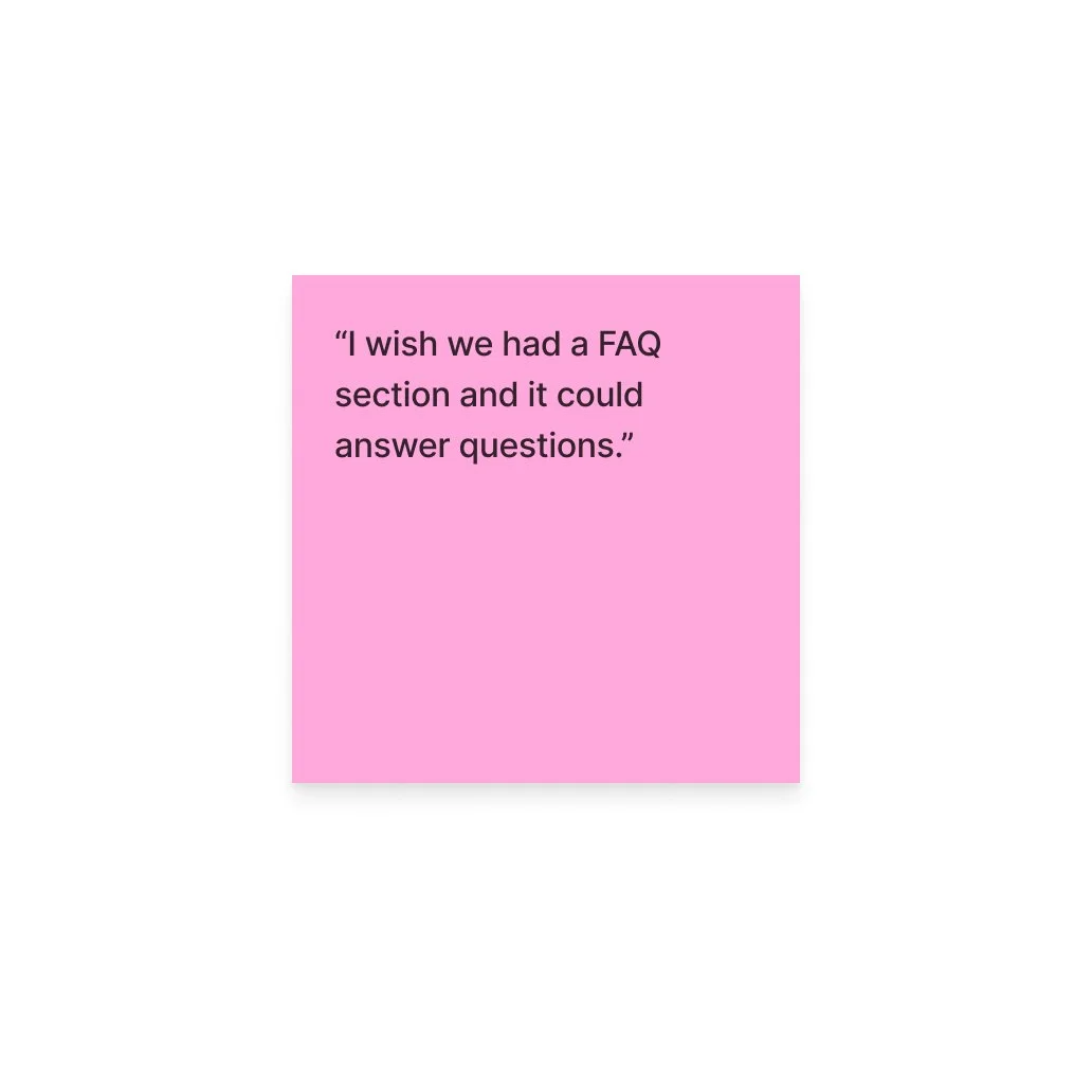
Product knowledge was difficult to access.
Changing beer menus meant bartenders, particularly newer or part-time staff, could not always confidently answer questions about unfamiliar products.
Small mistakes had larger consequences.
Accidentally selecting the wrong tab or missing important order information could lead to refunds, wasted products, slower service, and frustrated customers.
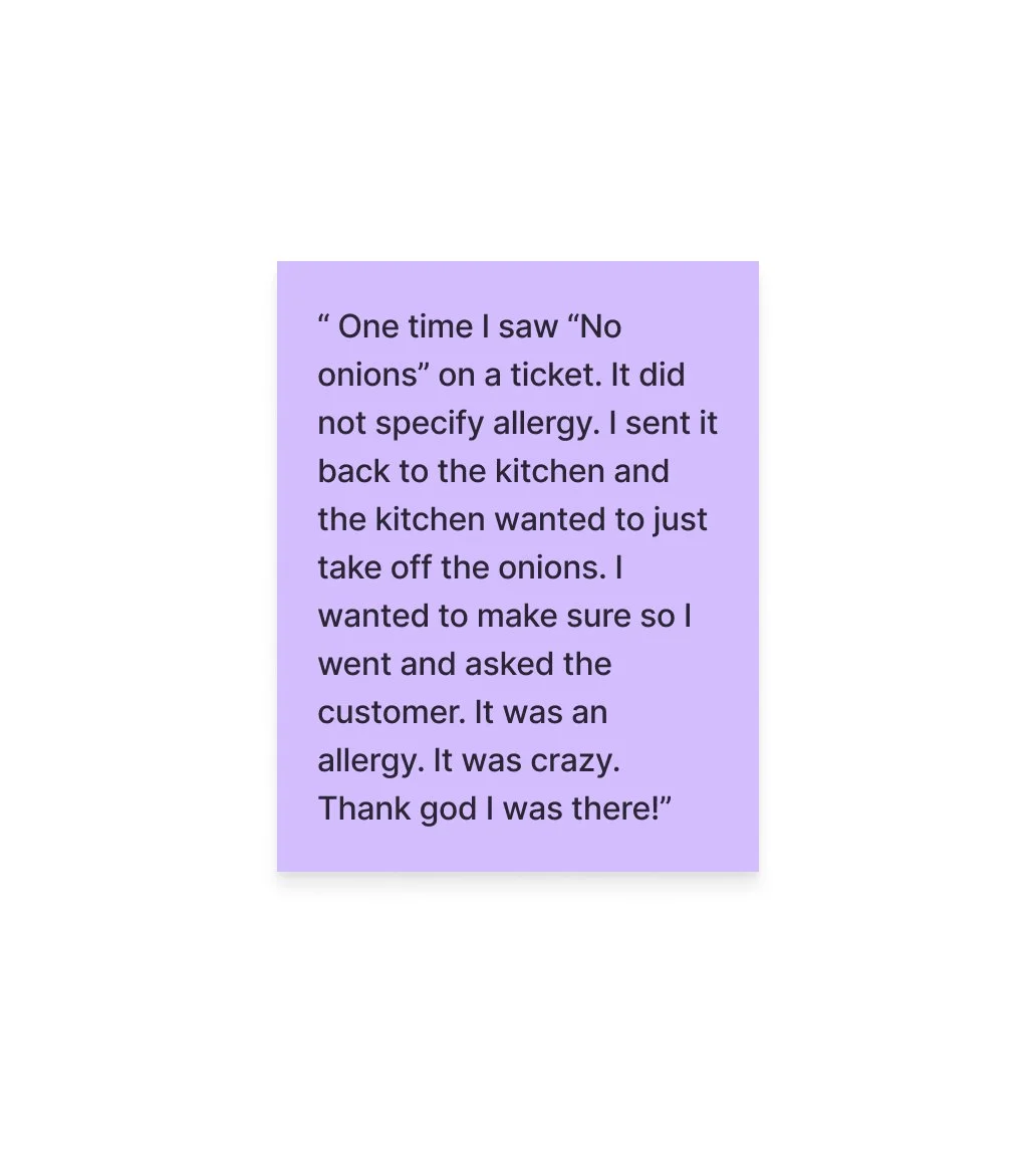
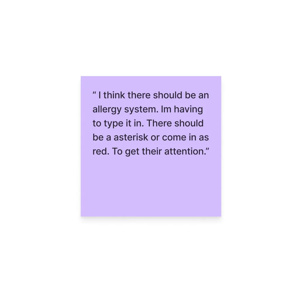
Allergy information needed stronger visibility.
Safety-critical information could become mixed in with ordinary notes and modifications, making it easier to overlook.
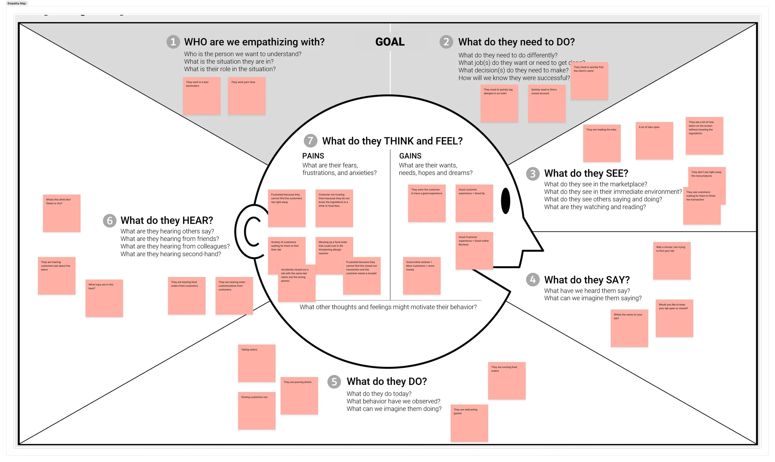
Empathy Mapping
I created an empathy map to turn research insights into a clearer picture of the bartender’s experience. By identifying what users think, feel, say, and do, I could better understand their frustrations and uncover opportunities to make Craft more intuitive and efficient.
User Personas
I translated these insights into a bartender persona representing someone working in a fast-paced hospitality environment. The persona needed to move quickly, maintain positive customer interactions, answer questions confidently, and avoid mistakes while managing several responsibilities at once.
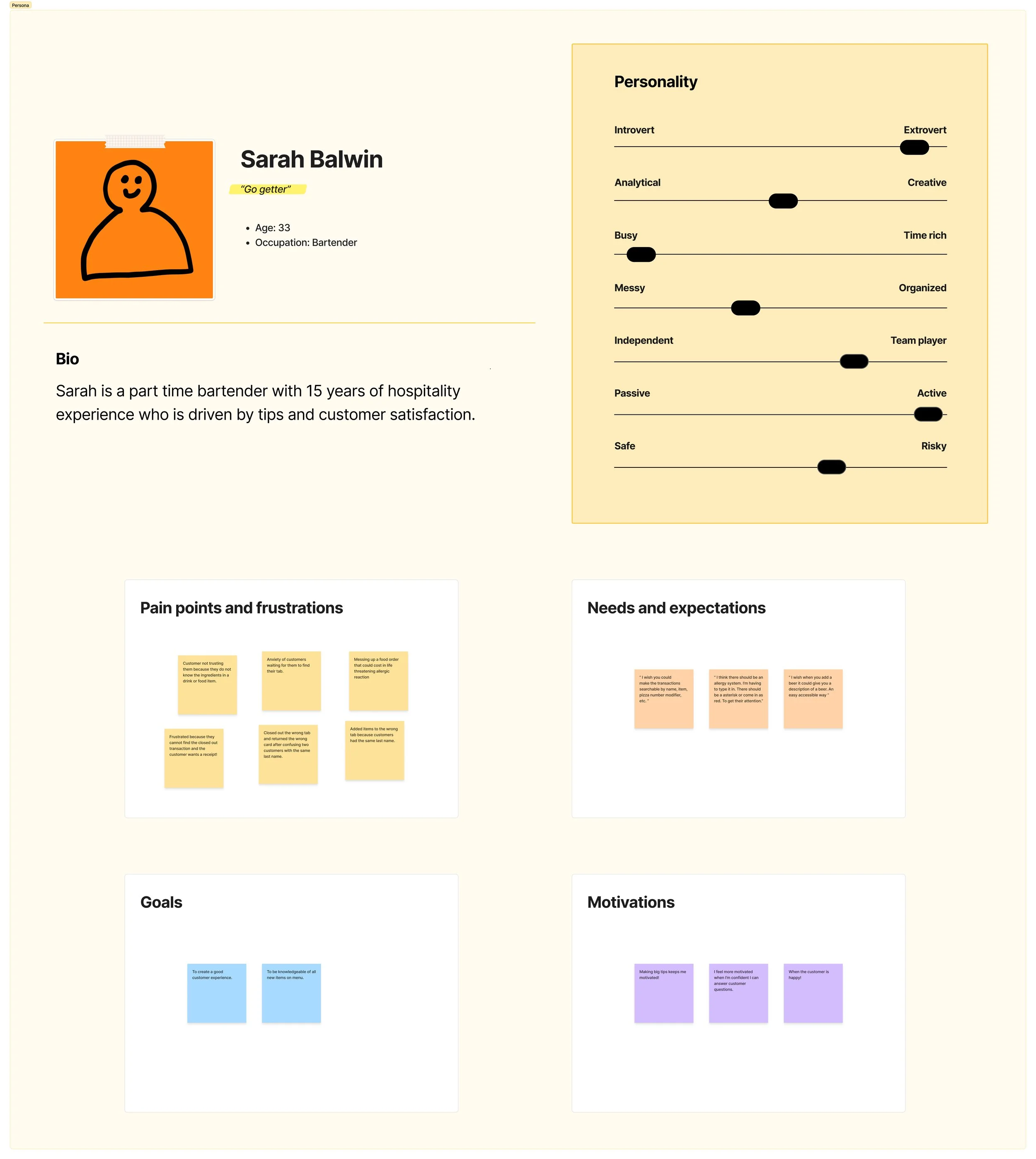
From the research, I narrowed the project to three core problems.
1. Finding the correct customer
Bartenders needed a faster way to locate customer tabs, particularly when multiple people shared the same or similar names. Selecting the wrong tab could lead to incorrect orders, payments, or even returning the wrong customer's card.
2. Accessing beer information
Employees needed product knowledge at the moment a customer asked a question. Leaving the POS, searching elsewhere, or finding another employee interrupted the service experience.
3. Communicating allergies
Allergy information needed to stand apart from ordinary food preferences and modifications so employees could immediately recognize when an order contained a safety concern.
-
Bartenders struggle to efficiently manage tabs and transactions, access product information, and communicate customer allergies during busy shifts. These workflow challenges increase stress, slow service, and create opportunities for errors that can negatively impact customer trust, satisfaction, and overall service quality.
-
We want to understand how users approach learning on YouTube over time so that we can design experiences that support skill-building, retention, and meaningful progress.
-
How might we help bartenders quickly distinguish between customers tabs with the same last name?
How might we assist bartenders and staff to quickly find answers to specific menu questions?
How might we ensure allergy information is clearly highlighted and consistently communicated from order entry to food preparation?
System Architecture & Task Flows: Translating Project Goals into Low-Friction Workflows
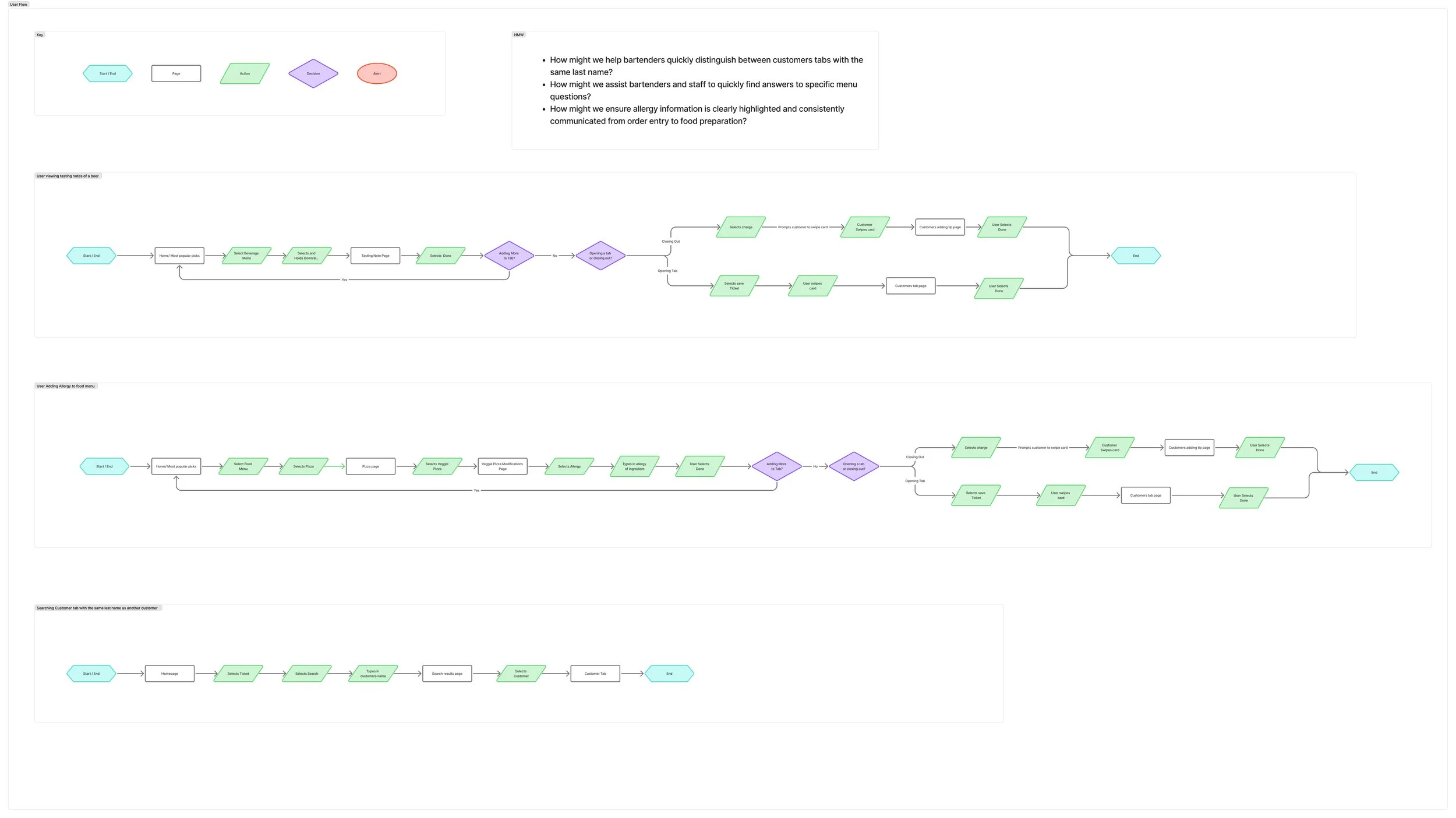
Within this framework, the user flows map out streamlined, low-friction user paths for frontline staff—enabling bartenders to search open tabs with dynamic surname highlighting, access tasting notes and hop profiles via the in-app Knowledge Hub, project high-visibility allergen warnings onto back-of-house kitchen prep displays, and complete card checkouts in minimal taps
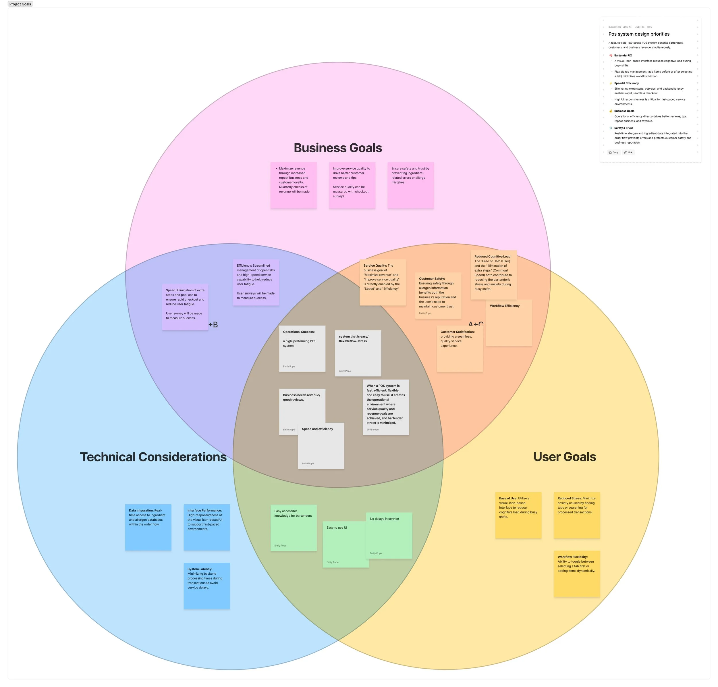
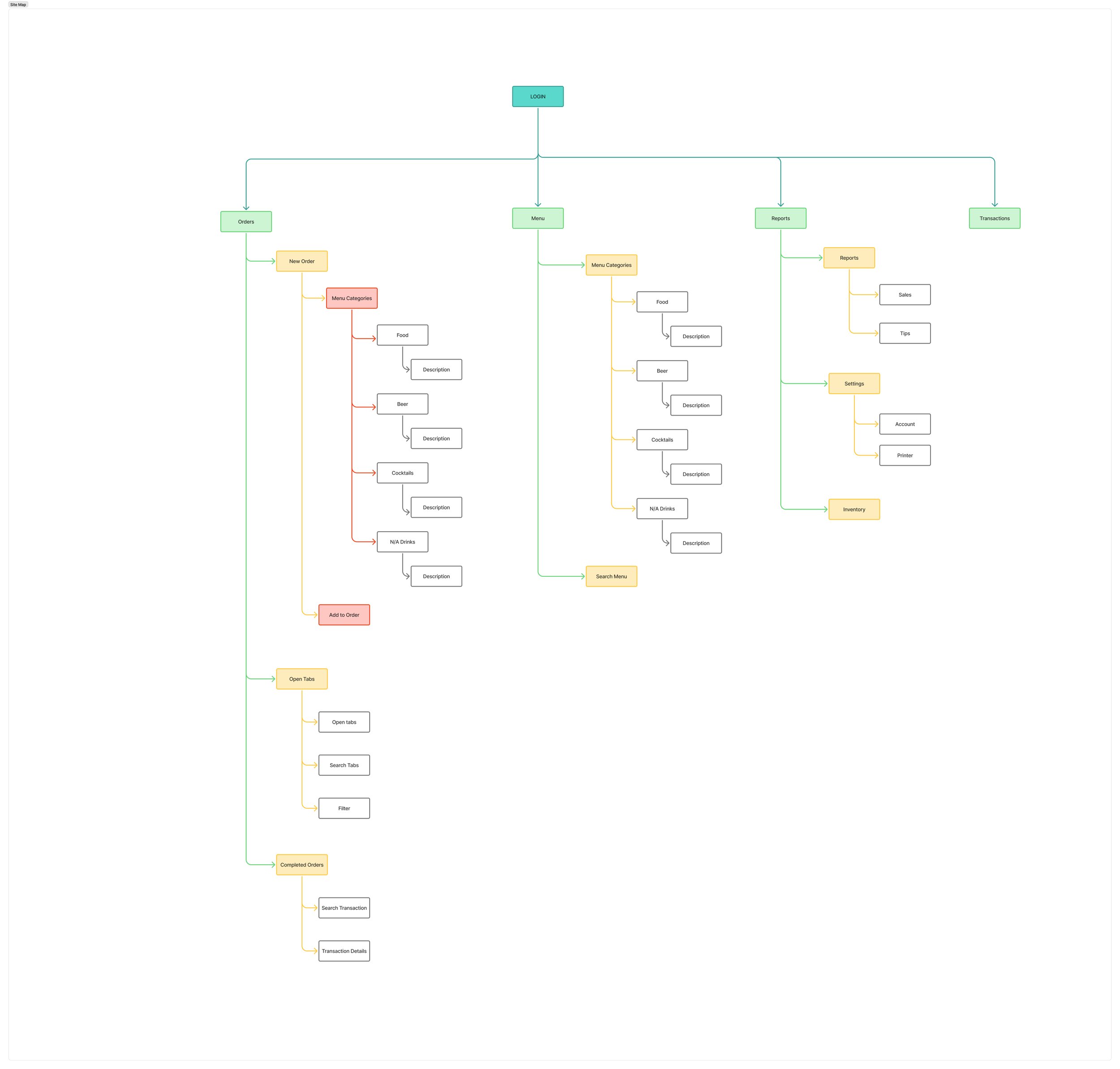
The primary Craft project goals focus on reducing cognitive load, eliminating transaction latency, and improving guest safety during high-volume shifts by equipping hospitality staff with an intuitive, low-stress POS interface. To support these goals, the system's site map is structured around a centralized architecture following login that branches into five core sections: Orders (New Orders, Open Tabs, Completed Orders), Menu (Categories for Food, Beer, Cocktails, and N/A Drinks), Reports (Sales and Tips), Settings (Account, Printers, Inventory), and Transactions.
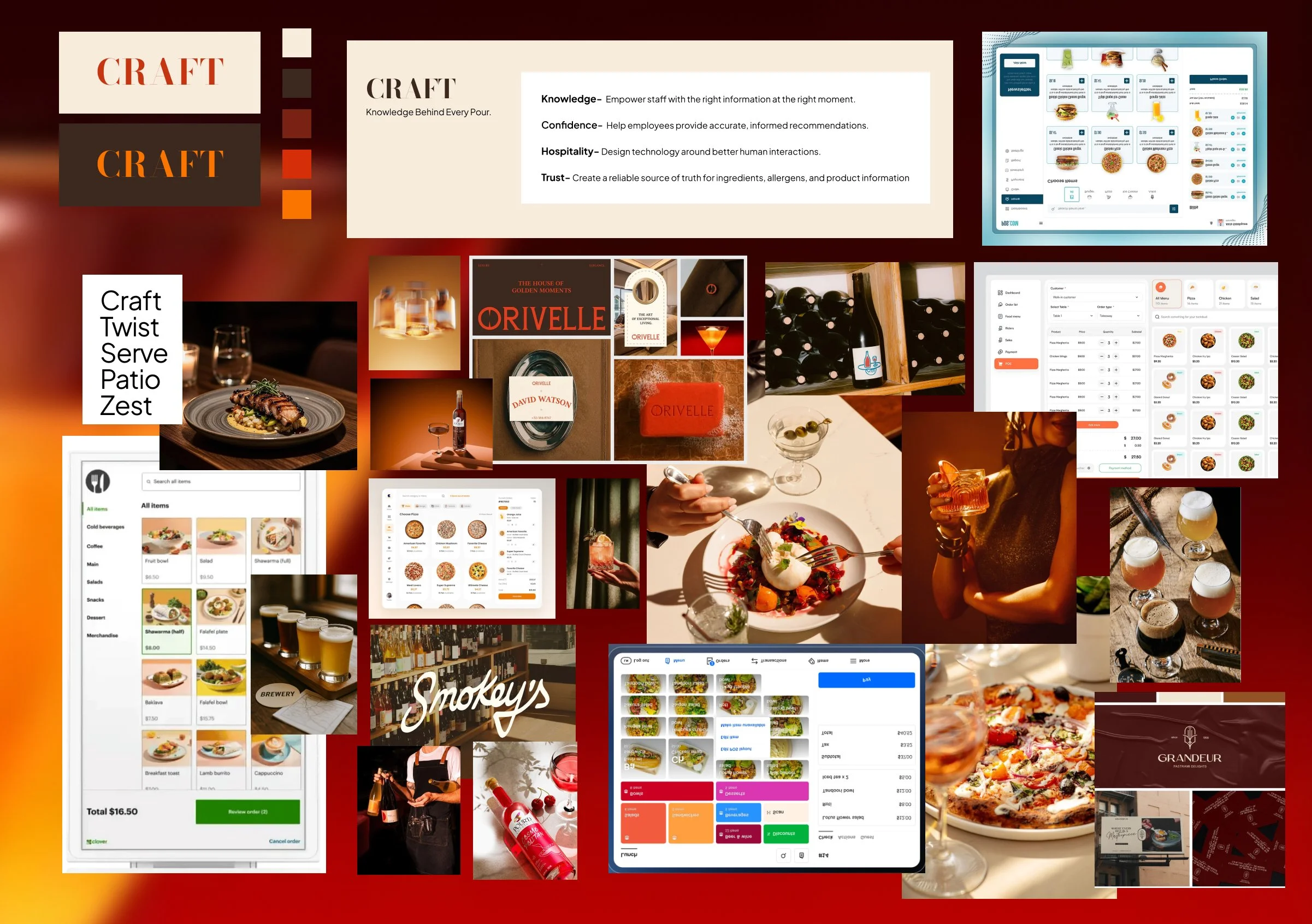
Defining the Craft Brand
Building the Craft Brand
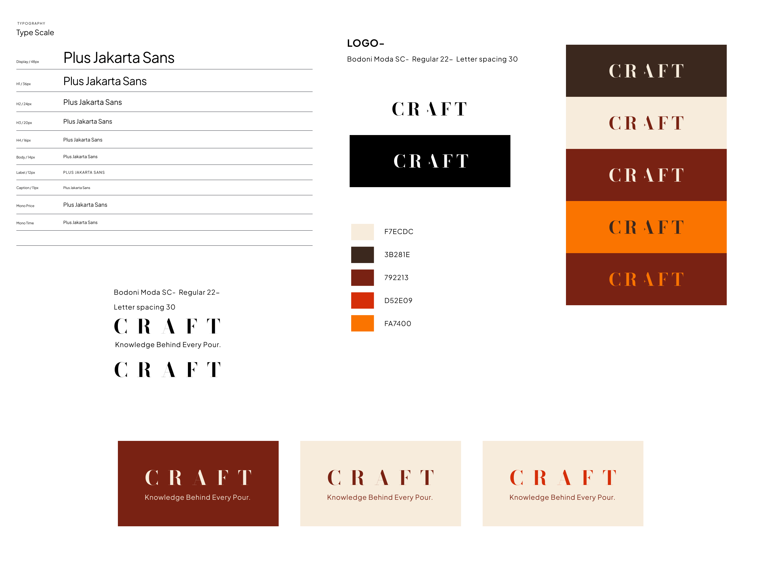
I wanted Craft to feel approachable, confident, and distinctly rooted in hospitality. The visual identity was designed to balance the warmth and personality of a craft bar with the clarity and efficiency expected from a modern POS system.
I developed the Craft logo, icon, color palette, and typography as a cohesive visual system. Warm neutrals create a welcoming foundation, while deep brown and bold red-orange accents bring contrast and energy to the interface.
The result is a brand identity that feels professional without feeling corporate, giving Craft a personality that can carry consistently across the POS interface, marketing materials, and hospitality environment.
Feature Prioritization Turned Pain Points Into a Focused MVP
Smarter Customer Tab Search
A complete POS system could contain dozens of features, so I intentionally avoided trying to redesign everything. Instead, I prioritized features that directly addressed the strongest problems uncovered during research.
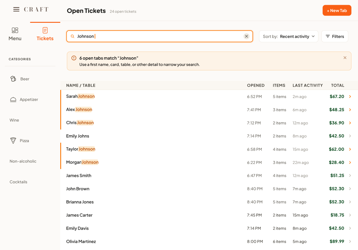
The goal was to reduce one of the most consequential mistakes uncovered during research: adding items to or closing the wrong customer's tab.
Beer Knowledge Hub
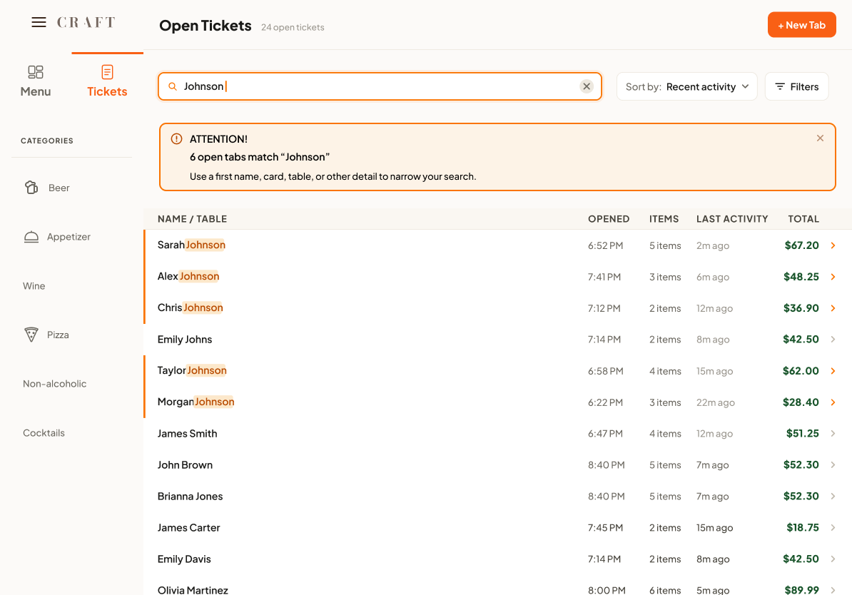
I designed an improved search experience that helps bartenders quickly distinguish between customers.
When several customers share the same last name, the interface alerts the employee that multiple matches exist and visually highlights the matching tabs. This gives bartenders additional context before selecting a customer without introducing a lengthy verification process.
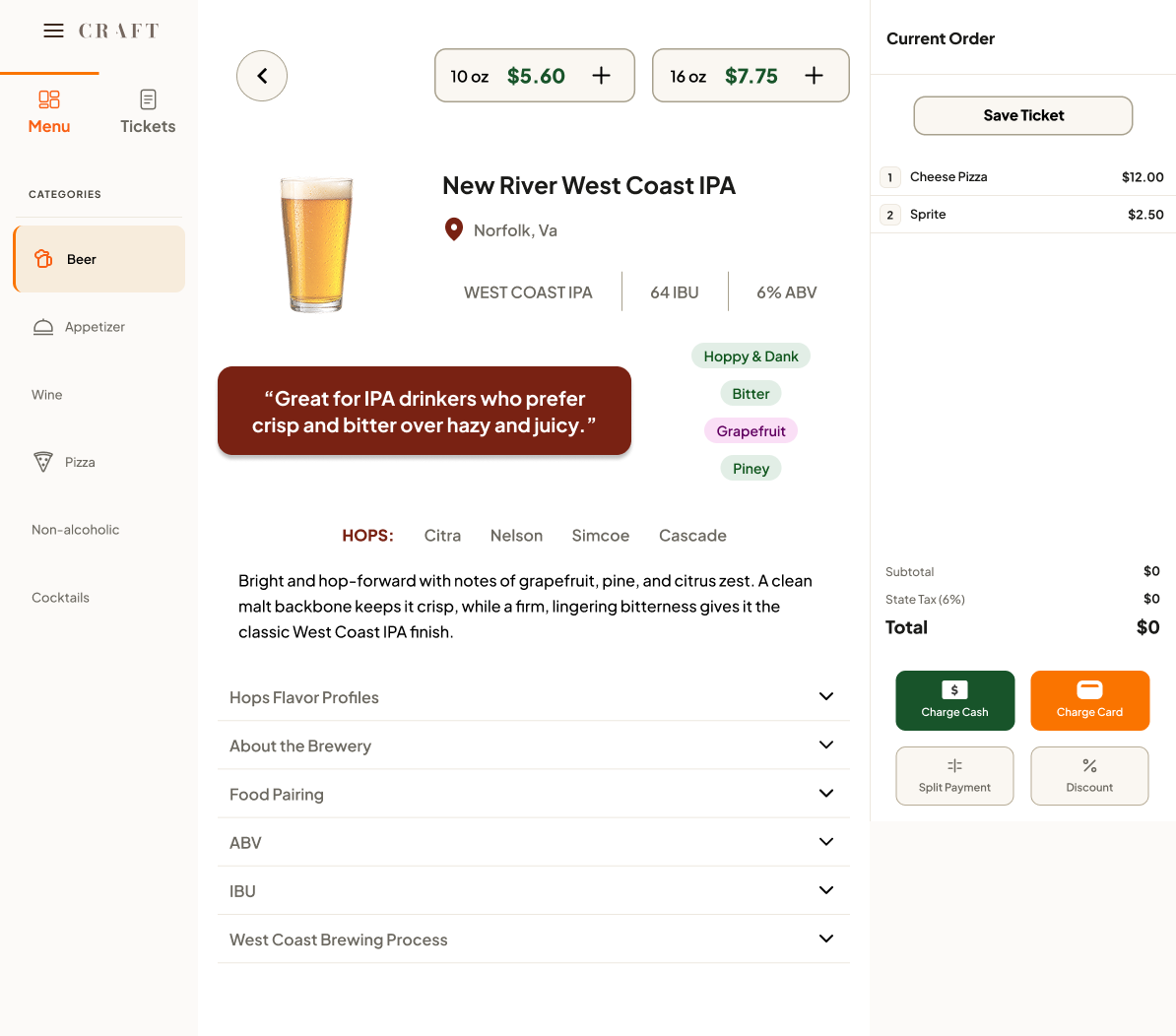
Research showed that employees often needed information about unfamiliar beers while speaking directly with customers.
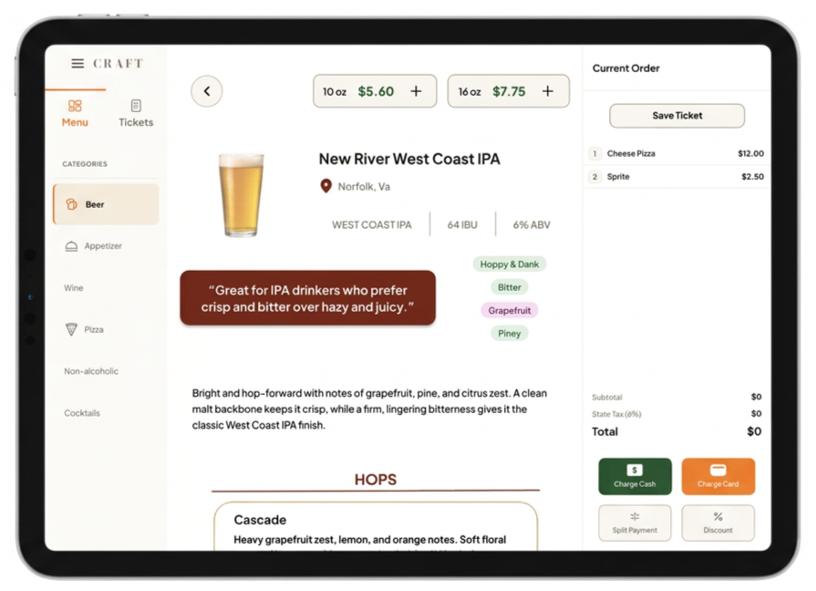
I designed an integrated Beer Knowledge Hub that keeps useful product information within the POS. Employees can quickly access details such as:
Tasting notes
Flavor profiles
ABV
IBU
Hop information
Beer descriptions
Instead of expecting every employee to memorize a changing menu, Craft provides the information when and where they need it.
Dedicated Allergy Workflow
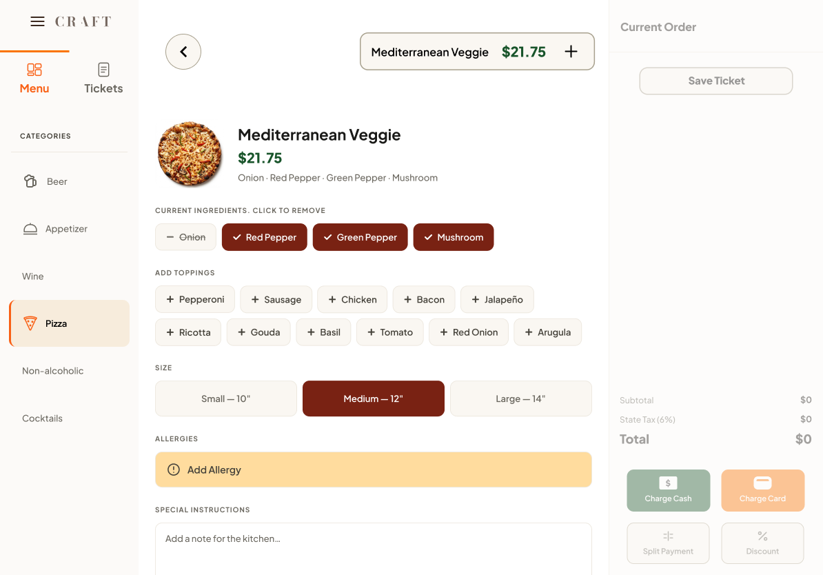
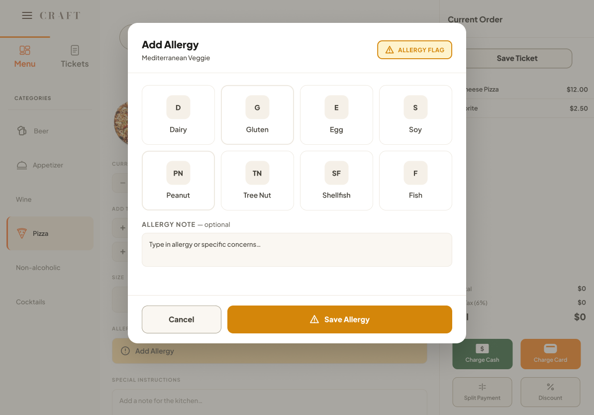
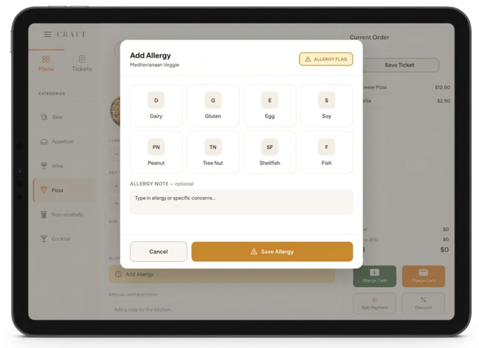
I also designed a specific workflow for entering customer allergies.
Instead of relying solely on a general note or modification field, employees can explicitly identify an allergy while modifying an order. Allergy information receives stronger visual emphasis so it remains distinct from normal customer preferences.
This allowed Craft to treat allergy communication as a safety feature rather than simply another modifier.
Together, these three solutions created a focused MVP built around the most meaningful problems identified through research.
Sketching out Low-Fidelity
View Tasting notes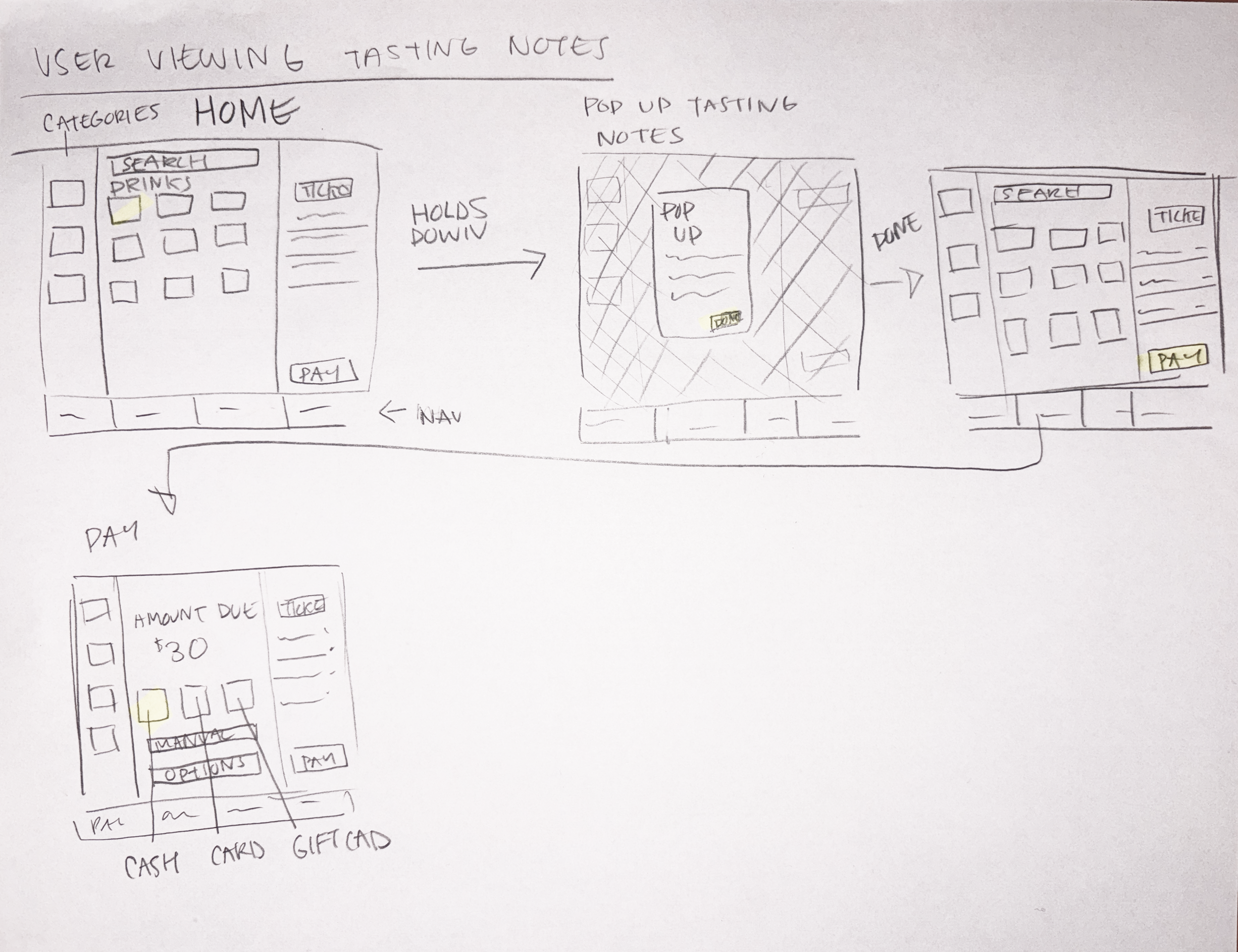
Adding Allergy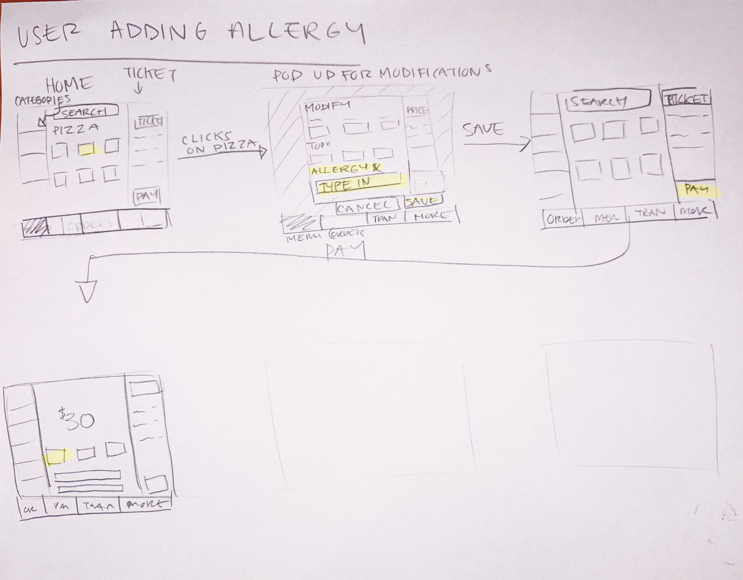
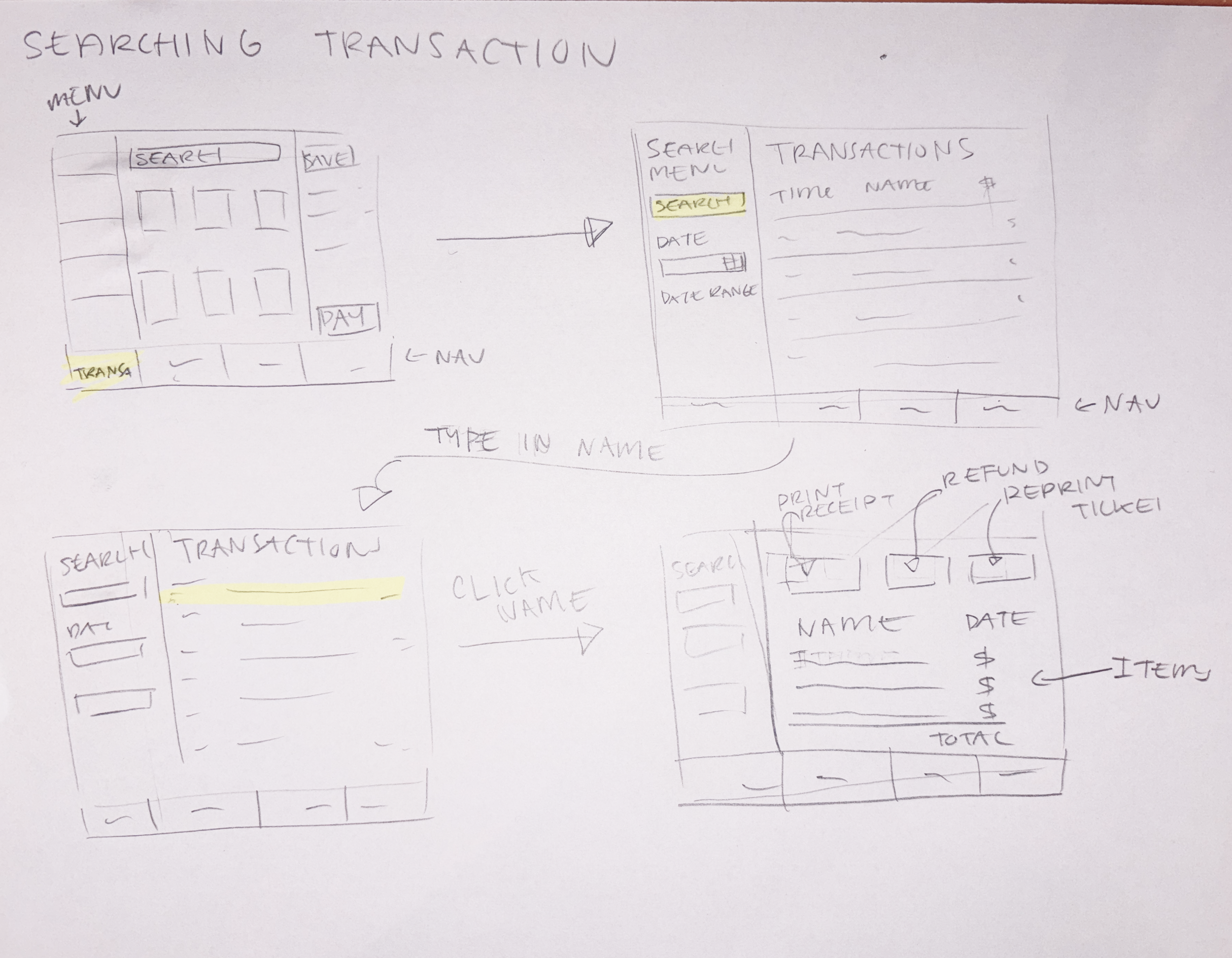
Searching TransactionFrom Sketches to Screens: AI-Assisted Design
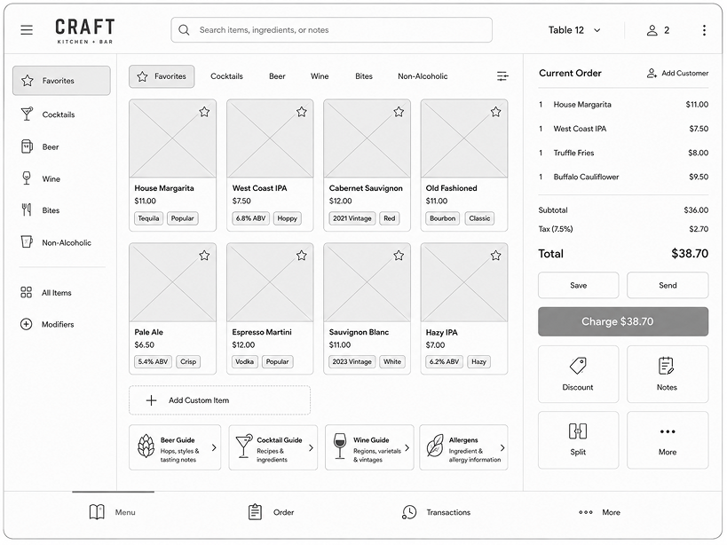
I translated my initial paper sketches into digital wireframes using AI, allowing me to quickly explore screen layouts and refine the experience before moving into high-fidelity design.
Usability Testing Validated the Core Experience and Guided Iteration
Once the high-fidelity prototype was complete, I conducted usability testing around Craft's core workflows.
Participants completed tasks involving customer tabs, ordering, beer information, allergy communication, and checkout. I evaluated whether users could complete each task independently while also observing moments of hesitation, confusion, or unexpected behavior.
93.75%
Independent task completion
100%
Overall task completion
Participants responded positively to the ordering and checkout experience, clear allergy notifications, and highlighted customer-tab search results.
Testing also revealed several areas that needed additional refinement.
The Two Problems:
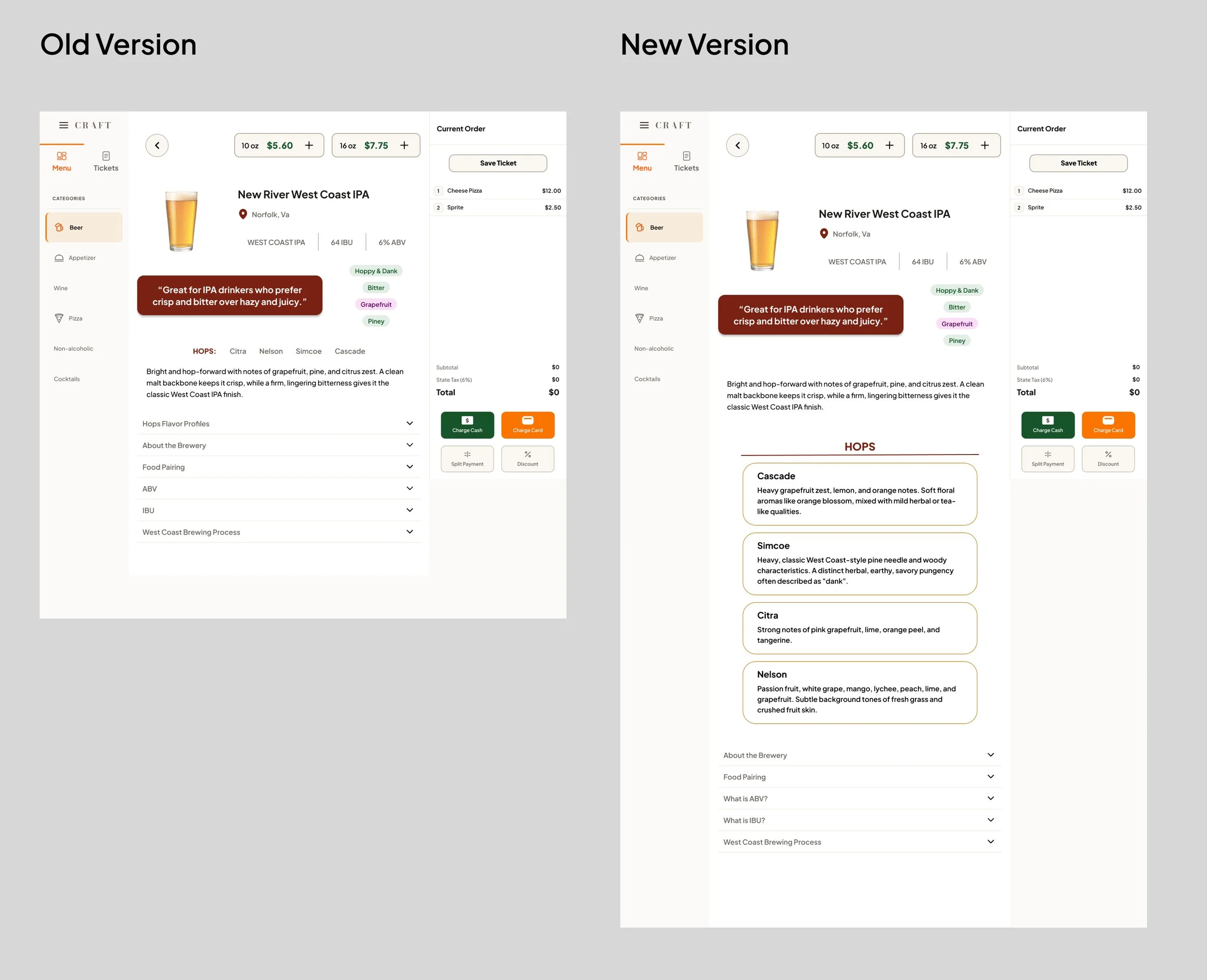
The Fix
Users could not notice the hops in the beer when prompted. Users also wanted to easily read the tasting notes of hops. This version reduces the step of scrolling to the bottom accordion to view hop profiles.
Iteration 1
Iteration 2
The Fix
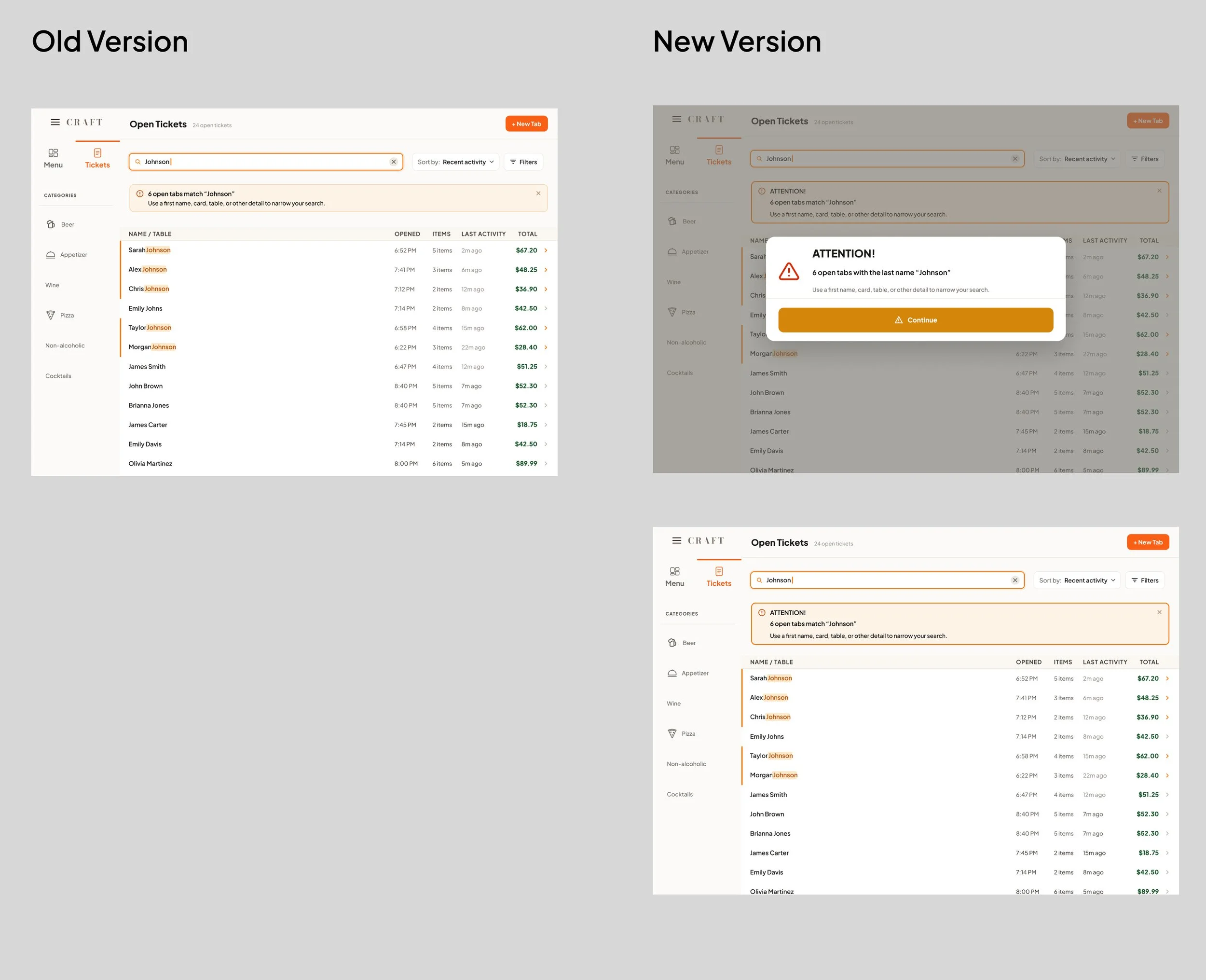
Users valued the highlighted names that were the same last name, but did not notice the alert at the top of the page. In this version, users are prompted first with an alert. this alert notifies users before they are able to move on with the transaction.
The duplicate-name warning needed stronger visibility.
Although participants were able to find the correct customer, the alert could be easier to notice during a fast interaction.Beer information needed a clearer entry point.
Once participants discovered the information, they understood how to use it. The next iteration would make the feature more discoverable, particularly for newer employees.