
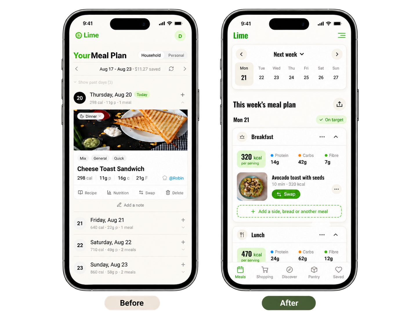
Lime Meal Planning
• UX Research • Product Redesign • UI Design • Branding
How do you turn usability friction into a clear product roadmap?
PROJECT: Client Project
ROLO: 2-Person UX Design Team
TOOLS: Figma, Claude, Google Notebook, Figjam
TIMELINE: 90 Hours
Across 7 moderated usability tests, we identified 9 key usability issues across Lime’s meal-planning and shopping experience. The findings were synthesized into 4 behavioral personas and prioritized into clear design opportunities, helping guide a more intuitive redesign of Lime’s core flows.
A quick snapshot
The Question
How might we redesign Lime to eliminate weeknight decision fatigue and administrative friction for busy, budget-conscious households?
The Solution
An evidence-based UX redesign driven by 7 usability tests, 4 behavioral personas, and competitive benchmarking across 6 rivals.
The Outcome
Synthesized research into a 53-item prioritization matrix, 3-sprint roadmap, and redesign of 3 core flows, turning usability findings into an actionable, engineering-ready backlog focused on reducing friction and supporting better household planning.
7
Usability sessions across 5 core application flows to observe real-world decision-making and task completion.
53
Usability findings documented and cataloged friction points across 7 application domains
4
Core user archetypes to align product capabilities directly with distinct human routines.
Auditing Lime to Uncover Where to Focus
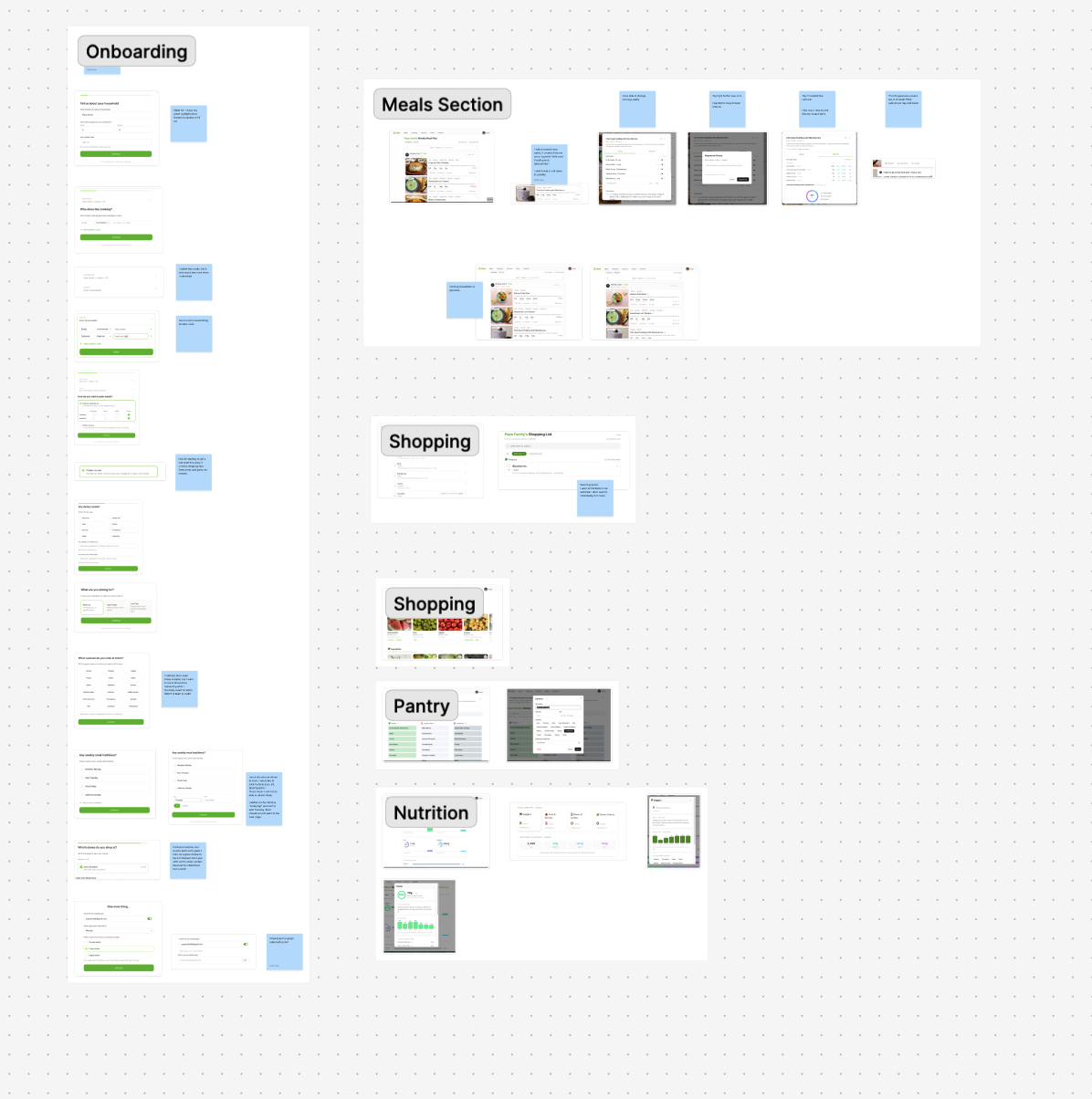
Lime is a meal-planning and grocery app in closed beta, designed to help households save time and money by connecting meal planning, shopping, pantry, and nutrition in one place. I began by auditing the existing product to understand the full experience and identify areas of friction across its core features. That review helped surface early usability concerns, especially within Meal Planning and Shopping, the two flows most central to the product.
From there, our two-person team used assumption storming to separate what we already knew from what still needed validation. We narrowed the project scope to those two core flows and turned our highest-risk assumptions into a focused usability test plan. Each session combined task-based testing with a short pre-test interview to understand participants’ household routines, planning habits, and existing tools.

Triangulating Evidence
To evaluate Lime’s closed-beta platform, we conducted 7 moderated think-aloud usability testing sessions across its 5 core user flows:
Onboarding
Meal Plans
Shopping List
Pantry Management
Nutrition Tracking
Observing participants navigate real-world task scenarios exposed severe mental model mismatches and interaction bottlenecks.
Competitive and Secondary research
To see the bigger picture, we ran a competitive analysis of six apps, Samsung Food, Mealime, Eat This Much, KitchenPal, AnyList, and Flipp, comparing them across the capabilities that matter for planning and shopping. That exposed a clear opening: every competitor was strong in one area but left the intersection of local deals, pantry, and household coordination half-covered. We backed this with secondary research on meal planning, food waste, grocery prices, and nutrition comprehension, so the findings rested on evidence and not just seven opinions.
This benchmark revealed that while competitors excel in isolated areas like discount fliers or macro tracking, none offer an integrated solution that unifies local store sale alerts, automated pantry tracking, and flexible multi-member household diets under one platform.
Desk research revealed that households in Canada throw away around 2.3 million tonnes of edible food each year, costing the typical household more than $1,300 annually. Meanwhile, driven by grocery inflation, 22.9% of households faced food insecurity in 2023. These metrics highlighted an urgent need for software designed to combat food waste via structured meal planning.
Qualitative Affinity Mapping
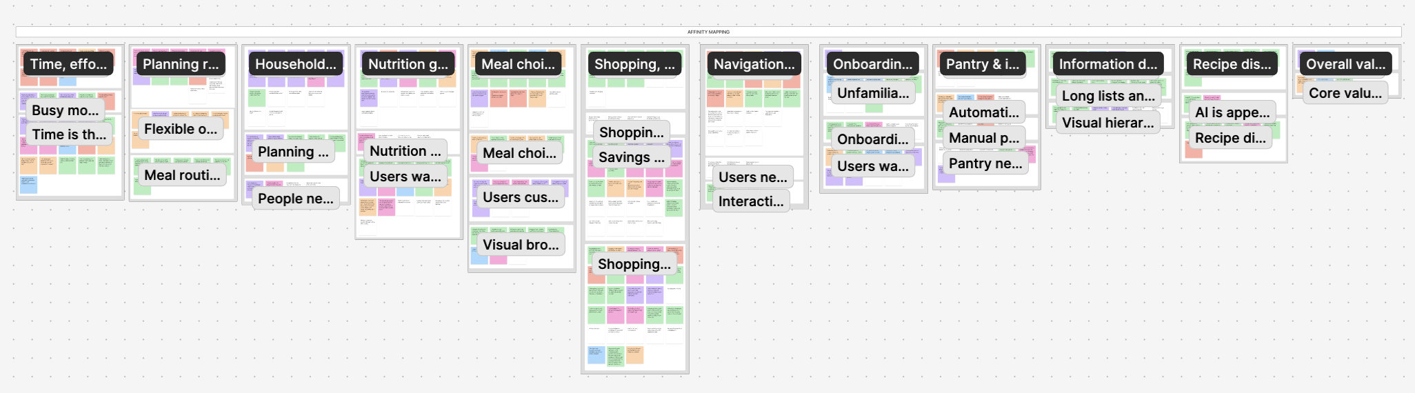
Synthesizing User Behaviors
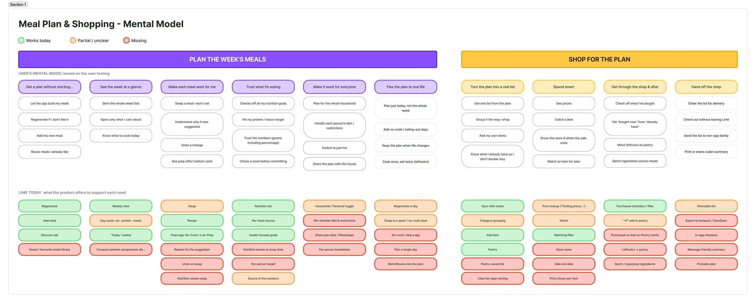
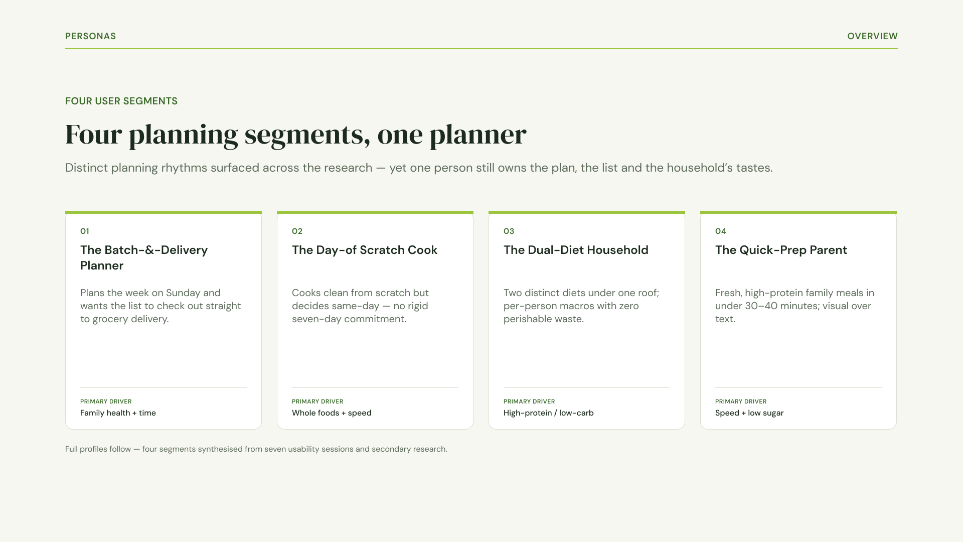
We clustered every observation into an affinity map until the themes were obvious, then wrote POV statements and How Might We questions to reframe each problem as something we could design against. As the themes consolidated, we narrowed a broad set of user types down to four behavioral personas, from the batch-and-delivery parent to the day-of scratch cook, so the segments stayed sharp rather than sprawling. We also mapped a mental model of how people actually plan and shop and set it against what Lime offers today, which made the gaps between user expectation and product behavior easy to point at.
Mental Mode
User Personas
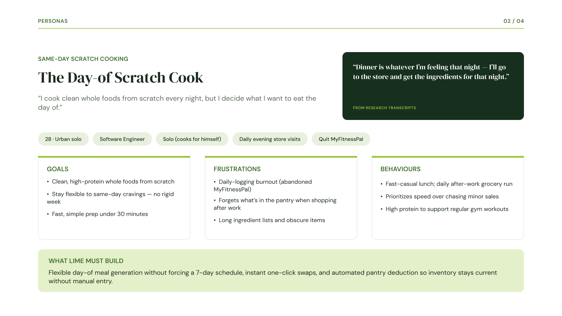
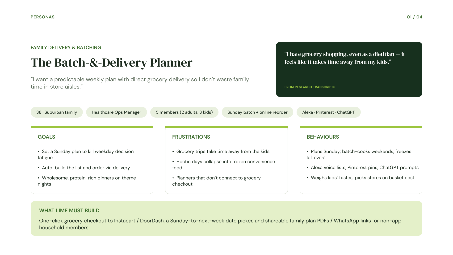
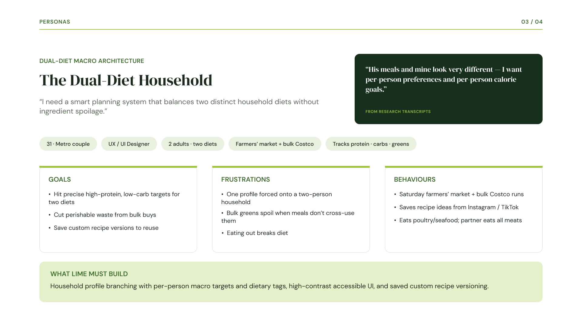
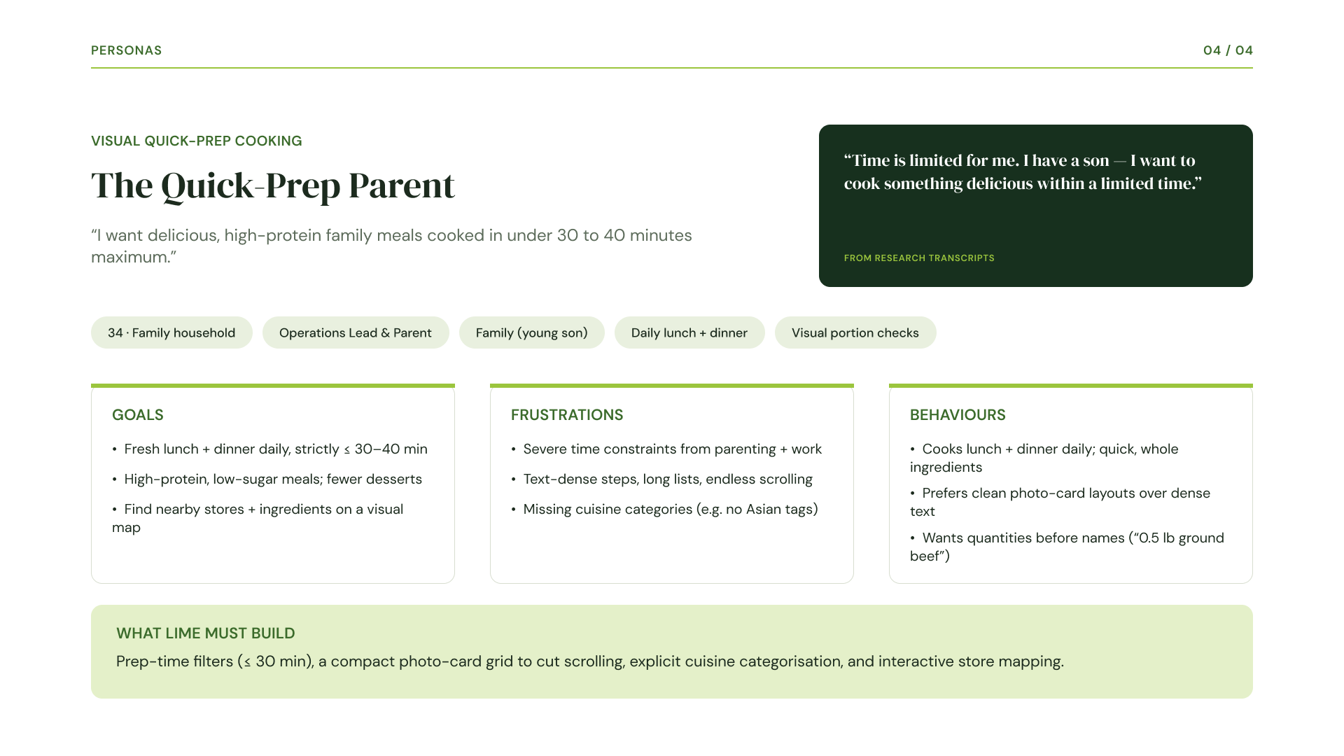
To align cross-functional team members around real user habits, I synthesized our seven test participants into four distinct behavioral personas:
Elena Vance (The Family Delivery Batcher): A working mother managing a family of five who plans on Sundays, relies on online grocery delivery via Instacart, and avoids physical store visits.
Marcus Thorne (The Same-Day Scratch Cook): A solo fitness enthusiast who cooks clean whole foods nightly, decides meals same-day based on cravings, and rejects rigid weekly pre-planning.
Maya Lin (The Dual-Diet Macro Architect): A UX designer managing a two-person household with conflicting macro and dietary goals who shops at farmers' markets and bulk stores.
Nur Adnan (The Visual Quick-Prep Cook): A working parent who preps daily family meals under a strict thirty-to-forty-minute limit and prefers compact photo cards over dense text.
Nine Findings, Pinpointing What to Fix
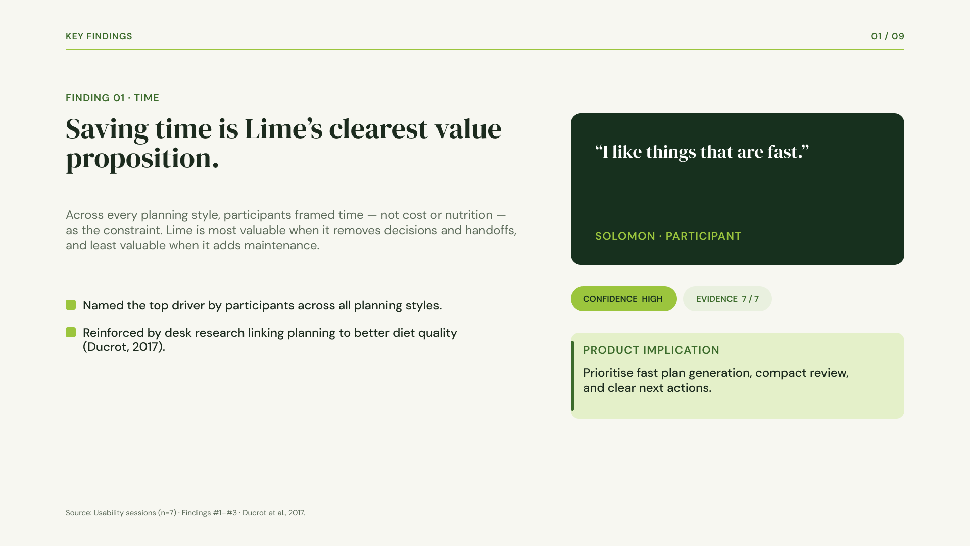
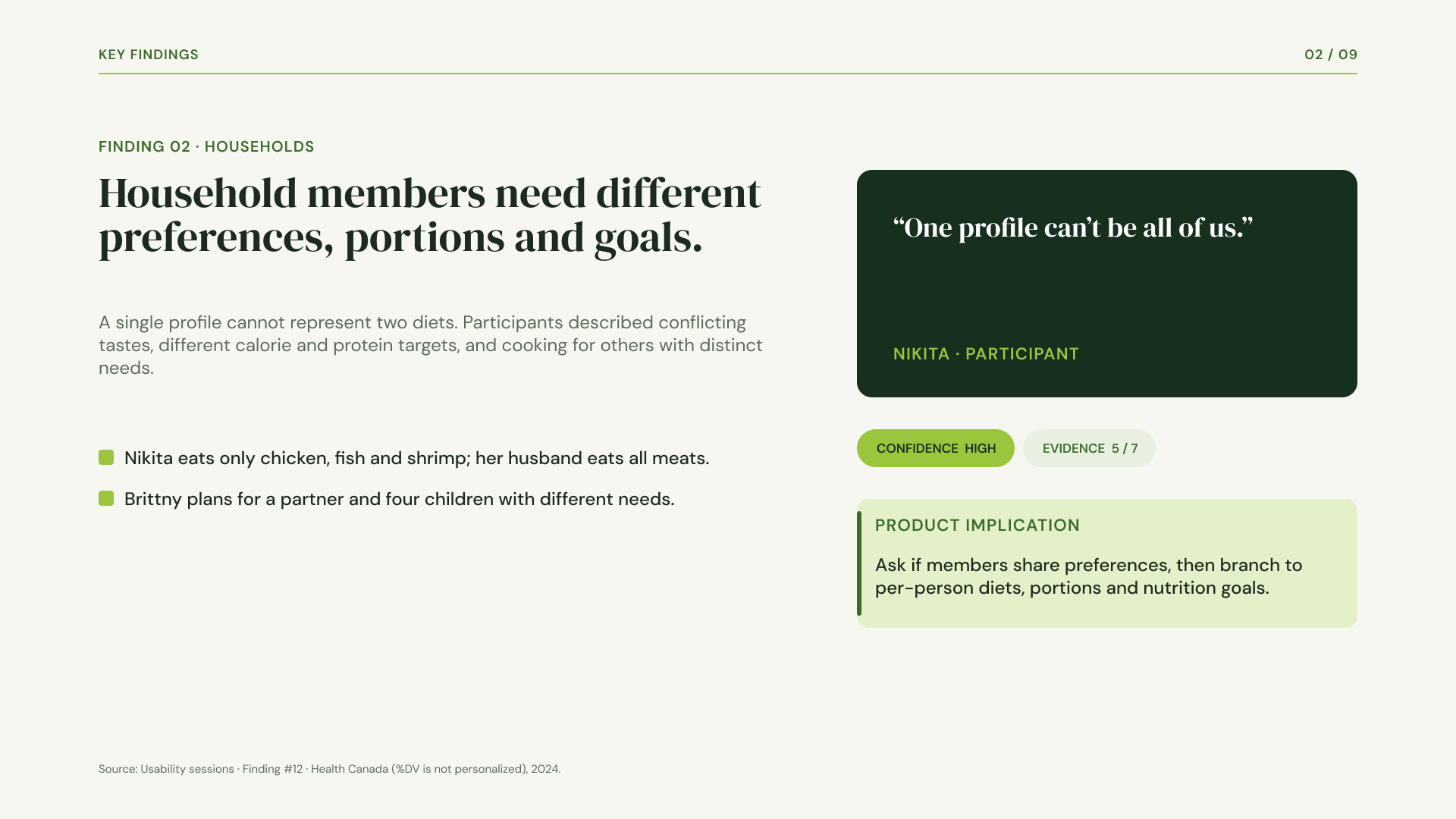
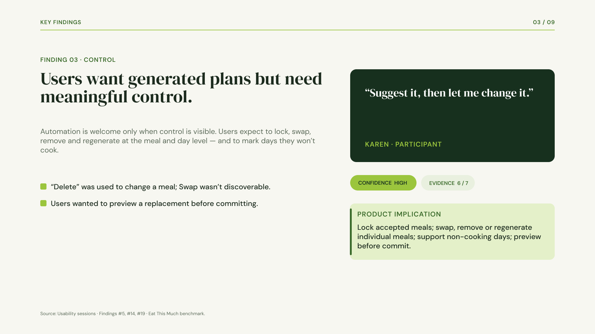
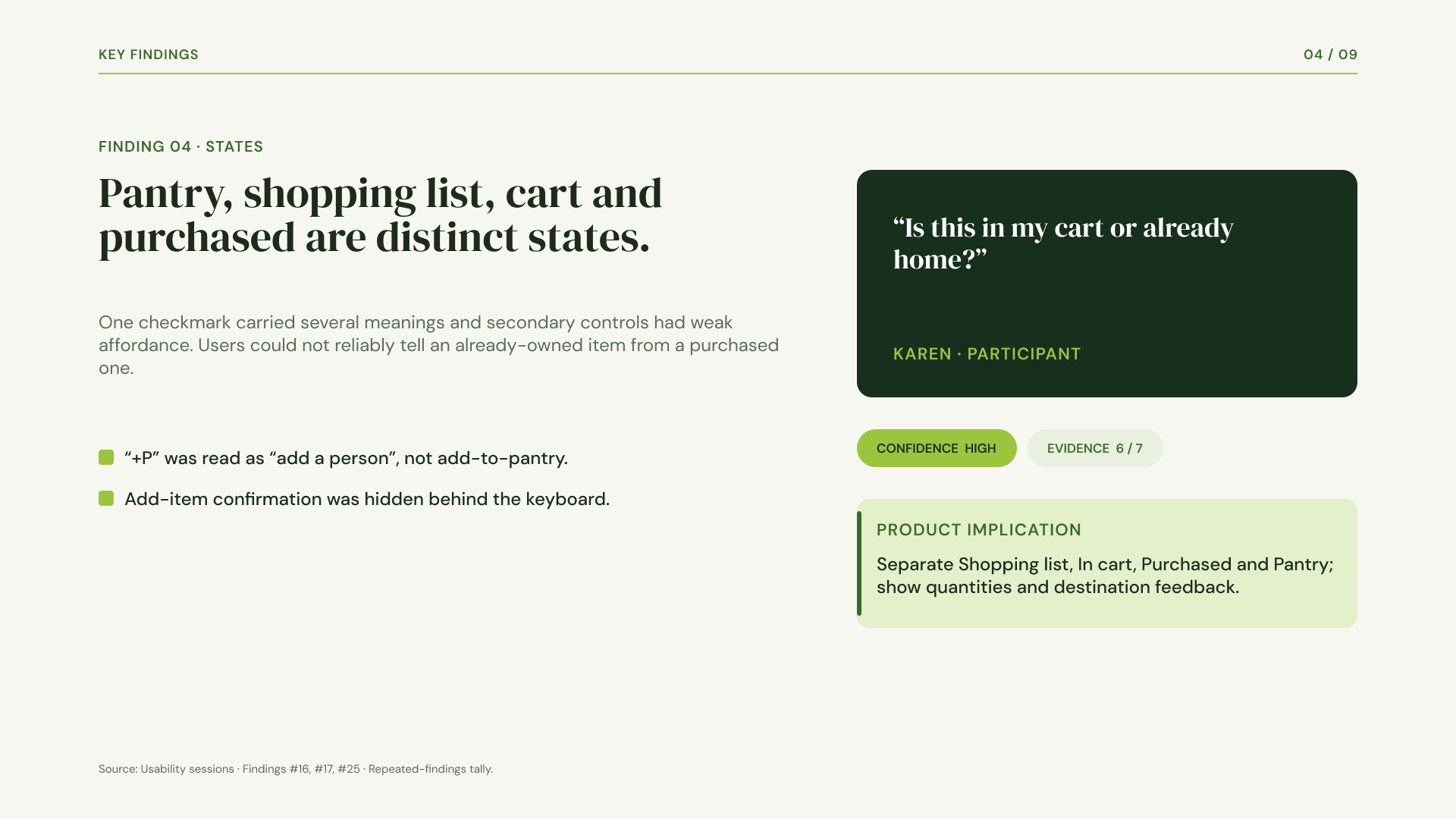
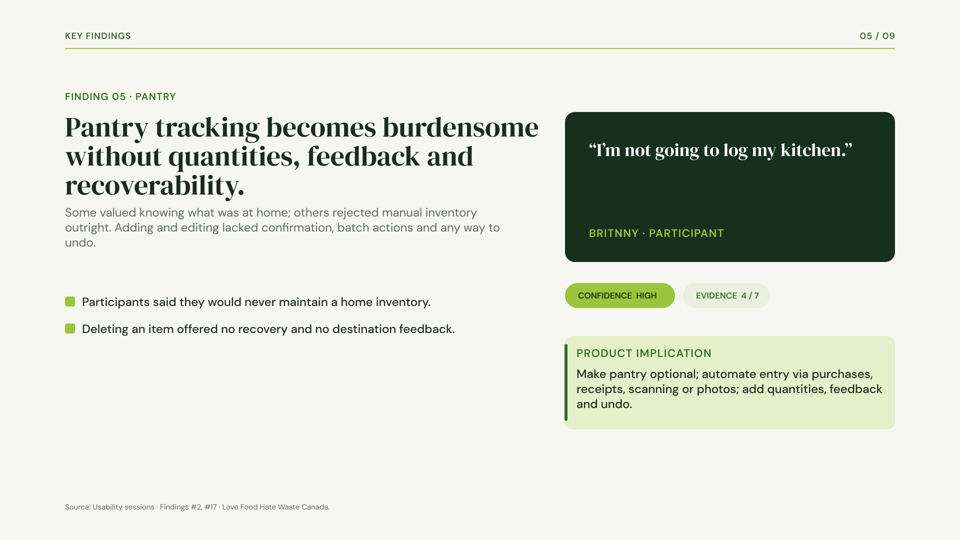
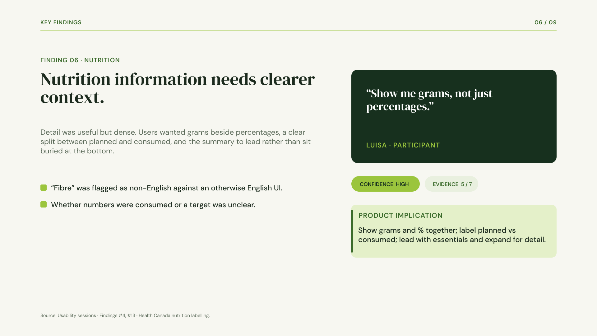
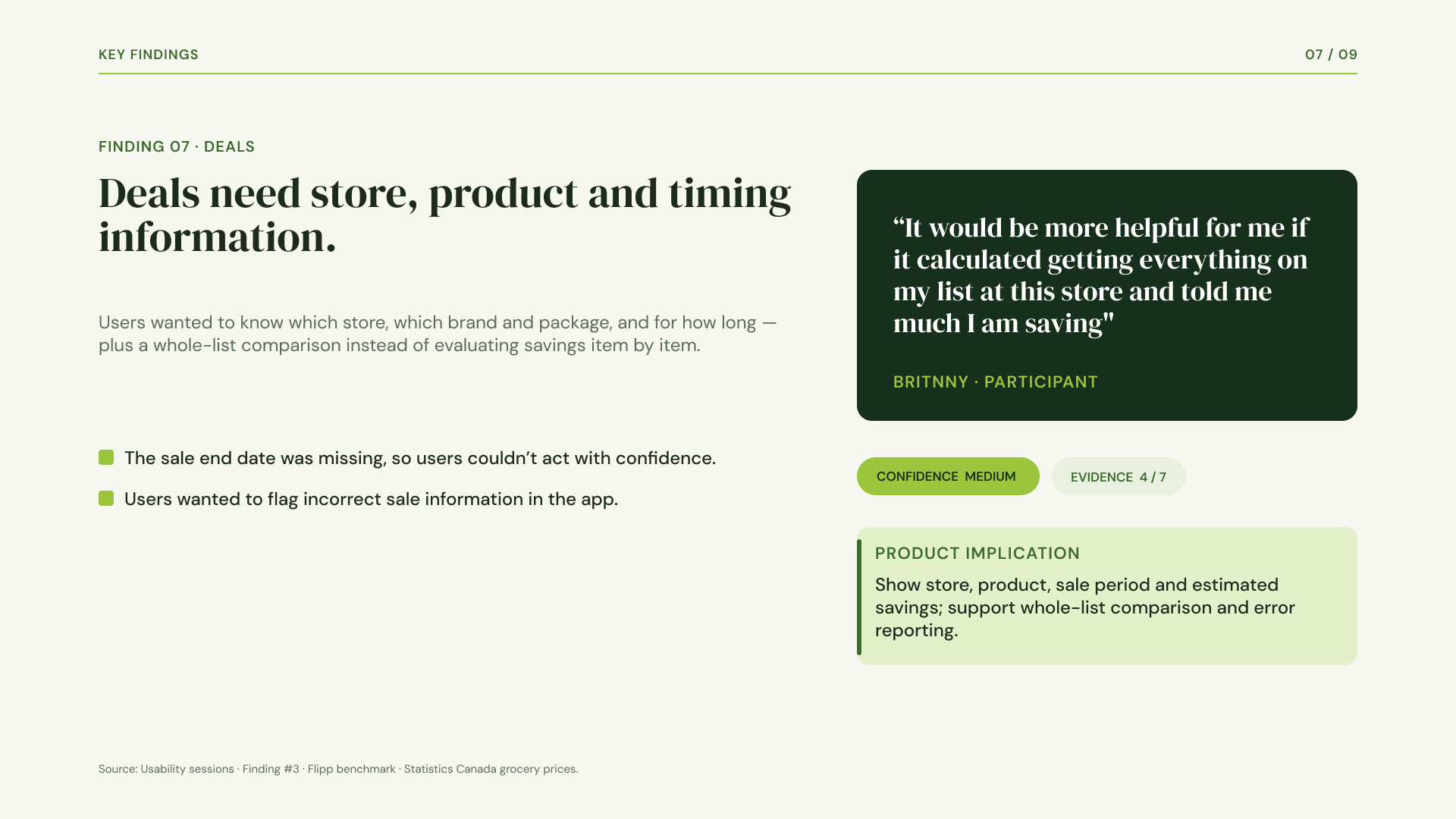
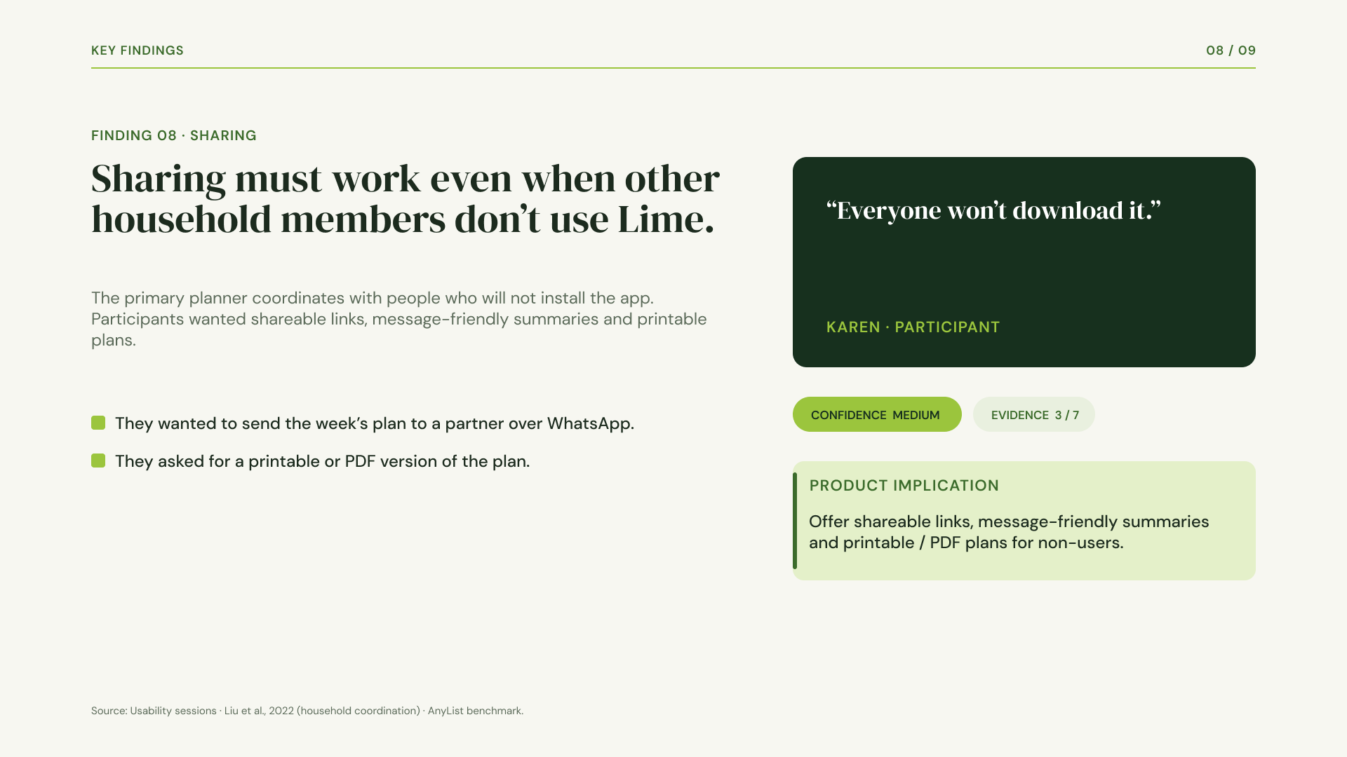
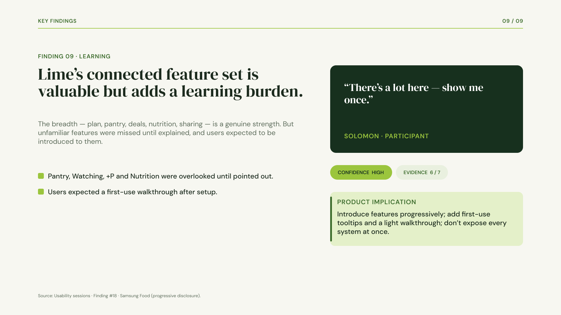
The synthesis produced nine key findings. They ranged from a household versus personal mix-up, where one profile could not hold two people's diets, to prices people did not trust and affordances that were unclear at a glance. We rated each finding by how confident we were and how much evidence sat behind it, and traced every one to the exact flow and screen where it hurt. The strongest findings carried participant quotes, so the client could hear the problem in the user's own voice rather than take our word for it.
Opportunities
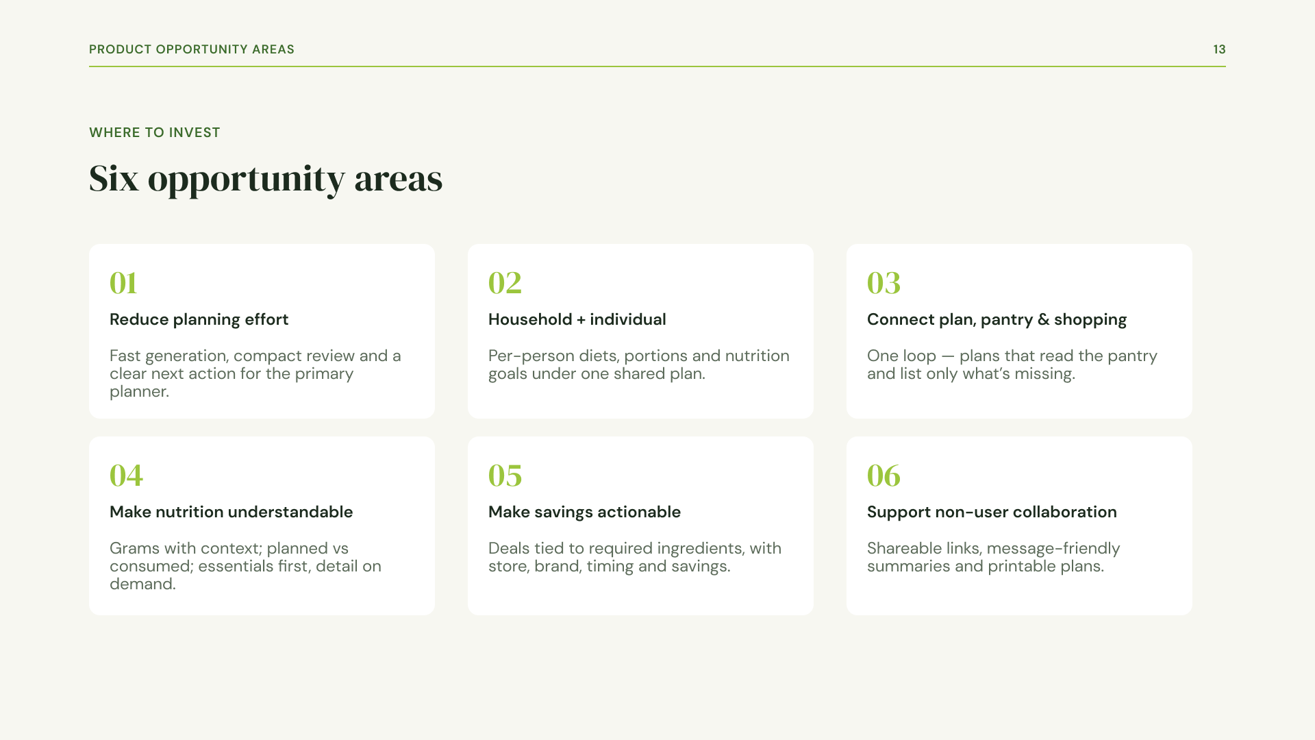
-
In early testing of Lime's closed-beta meal-planning and grocery app, users consistently got stuck in the two core workflows: planning weekly meals and turning those plans into a grocery shop. Time constraints and workday exhaustion emerged as the primary friction drivers, causing healthy eating intentions to collapse into ordering takeout or grabbing convenience food on busy nights
-
The primary project objective was to evaluate Lime's closed-beta experience across its five core flows—Onboarding, Meal Plans, Shopping List, Pantry, and Nutrition—to diagnose usability friction and establish an evidence-backed, prioritized product roadmap.
Specifically, the design goals were to:
Test End-to-End Execution: Determine whether users could complete the core plan → shop → track loop without assistance or trust breaks.
Establish a Connected Household Hub: Transform Lime's weekly plan into a trustworthy decision hub that seamlessly connects meal schedules, local store sales, and pantry inventory into a single loop.
Minimize Administrative Effort: Reduce cognitive load and decision fatigue so busy household planners could effortlessly maintain healthy routines
-
How might we streamline weekly plan generation and customization so busy planners can create flexible, trustworthy meal schedules without cognitive overload or manual effort?
How might we accommodate households with conflicting dietary restrictions, individual calorie/macro goals, and different portion needs under a single shared account?
How might we connect meal plans, automated pantry tracking, local store deals, and 1-click grocery checkout into a seamless loop that eliminates manual inventory chores and reduces food waste?
System Architecture & Task Flows: Translating Project Goals into Low-Friction Workflows
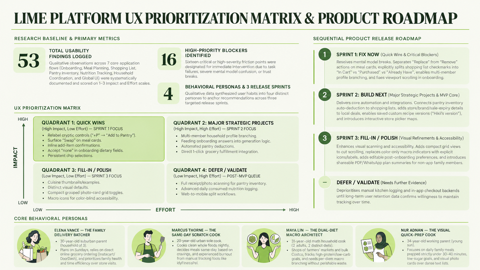
Findings only help if a team knows what to do first. We scored each fix by impact and effort in a UX prioritization matrix, and that impact-versus-effort scoring is what broke ties when everything felt urgent. From there we sorted the fixes into fix now, MVP, defer, and needs validation, tying each recommendation back to the finding it solved so nothing came down to taste. We handed the client a research report and the matrix together, giving them a ranked, evidence-backed roadmap they could act on straight away.
Rebranding Lime
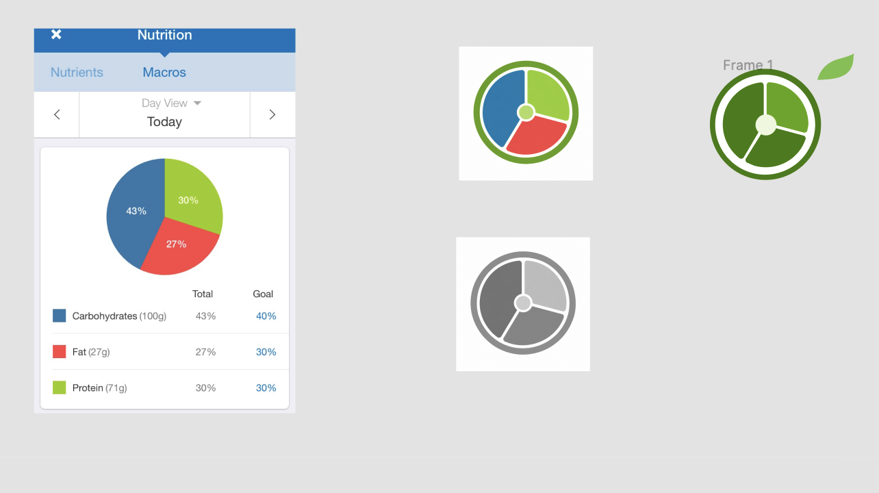
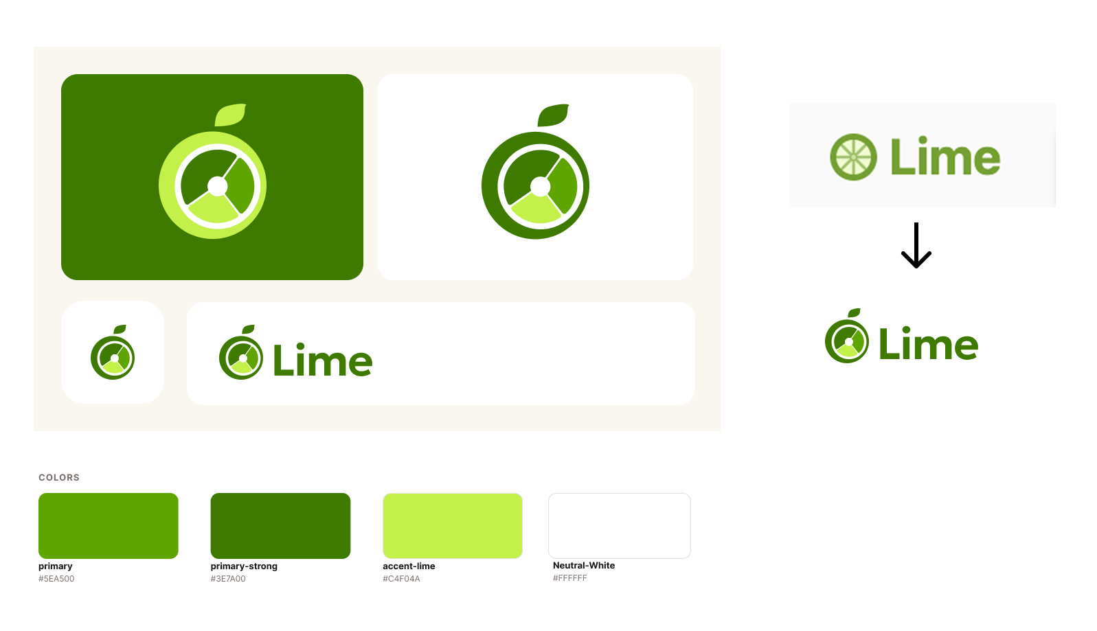
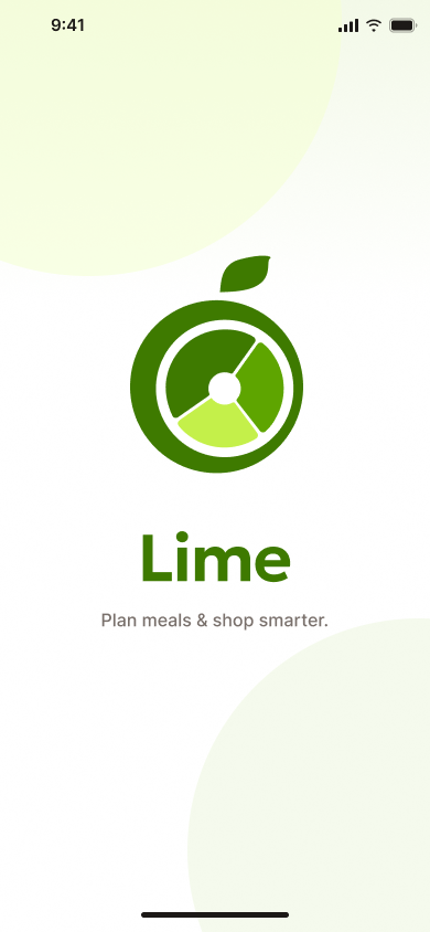
During initial usability testing, the original Lime logo created severe brand confusion, with participants repeatedly misinterpreting it as Lime electric scooters, the LimeWire music downloading platform, or even a beer brand rather than a meal-planning app. To eliminate this ambiguity and establish immediate category clarity on the homepage, the logo and visual identity were redesigned around a fresh, food-focused aesthetic. By replacing ambiguous, scooter-like geometry with warm, approachable typography and vibrant lime-green branding accents, the updated logo clearly communicates a fresh, health-focused household planning hub before users even begin onboarding.
During initial usability testing, the original Lime logo created severe brand confusion, with participants repeatedly misinterpreting it as Lime electric scooters, the LimeWire music downloading platform, or even a beer brand rather than a meal-planning app. To eliminate this ambiguity and establish immediate category clarity on the homepage, the logo and visual identity were redesigned around a fresh, food-focused aesthetic. By replacing ambiguous, scooter-like geometry with warm, approachable typography and vibrant lime-green branding accents, the updated logo clearly communicates a fresh, health-focused household planning hub before users even begin onboarding.
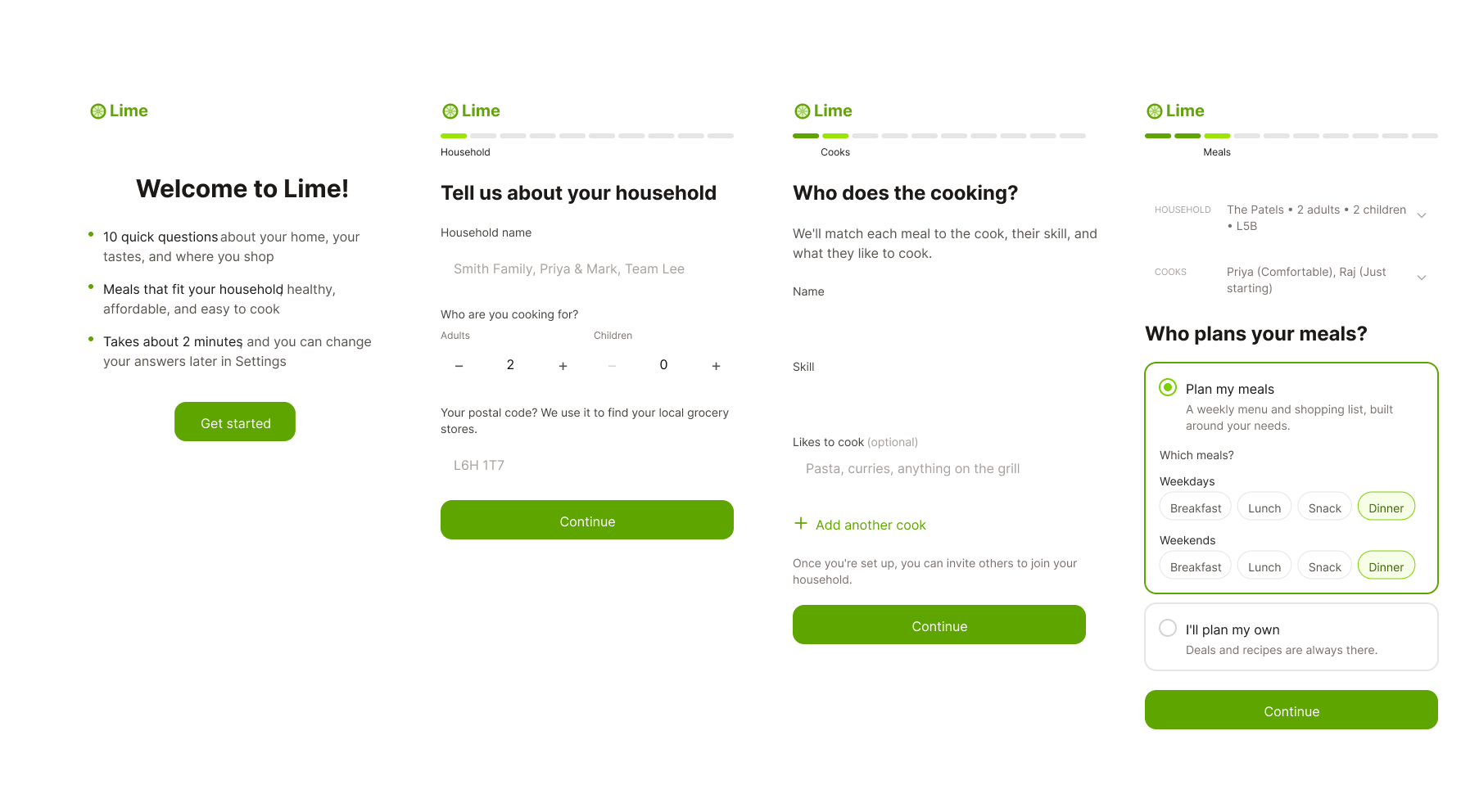
During usability testing, 10 key onboarding friction points were identified across user setup, form inputs, and system feedback.
Turning Insights Into Product Opportunities
Onboarding
Existing Screens
Unclear Value Proposition at Entry
The Issue: New users frequently mistook Lime for a meal-delivery service rather than a planning app, and the opening screen jumped straight to login without a proper sign-up flow.
The Fix: Clarified the headline value proposition ("Plan & Shop," not meal delivery) on the first screen and implemented a standard sign-up sequence.
New High-Fidelity Screens
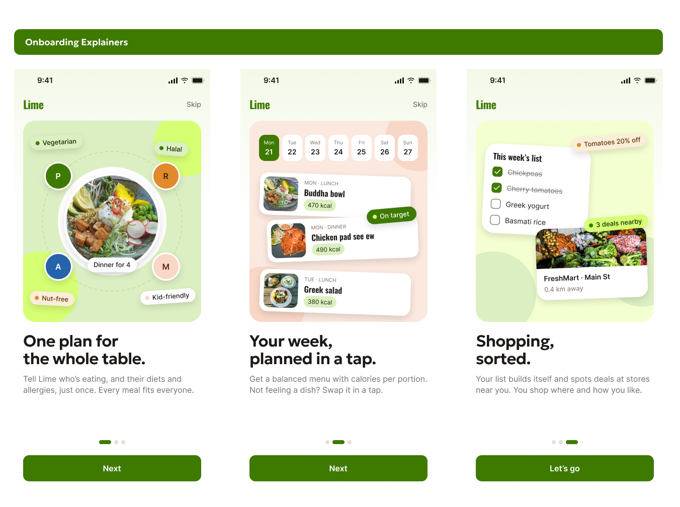
Three screens before onboarding sell the core value — one shared plan, a planned week, sorted shopping — before asking for an account. Skip jumps straight to Welcome.
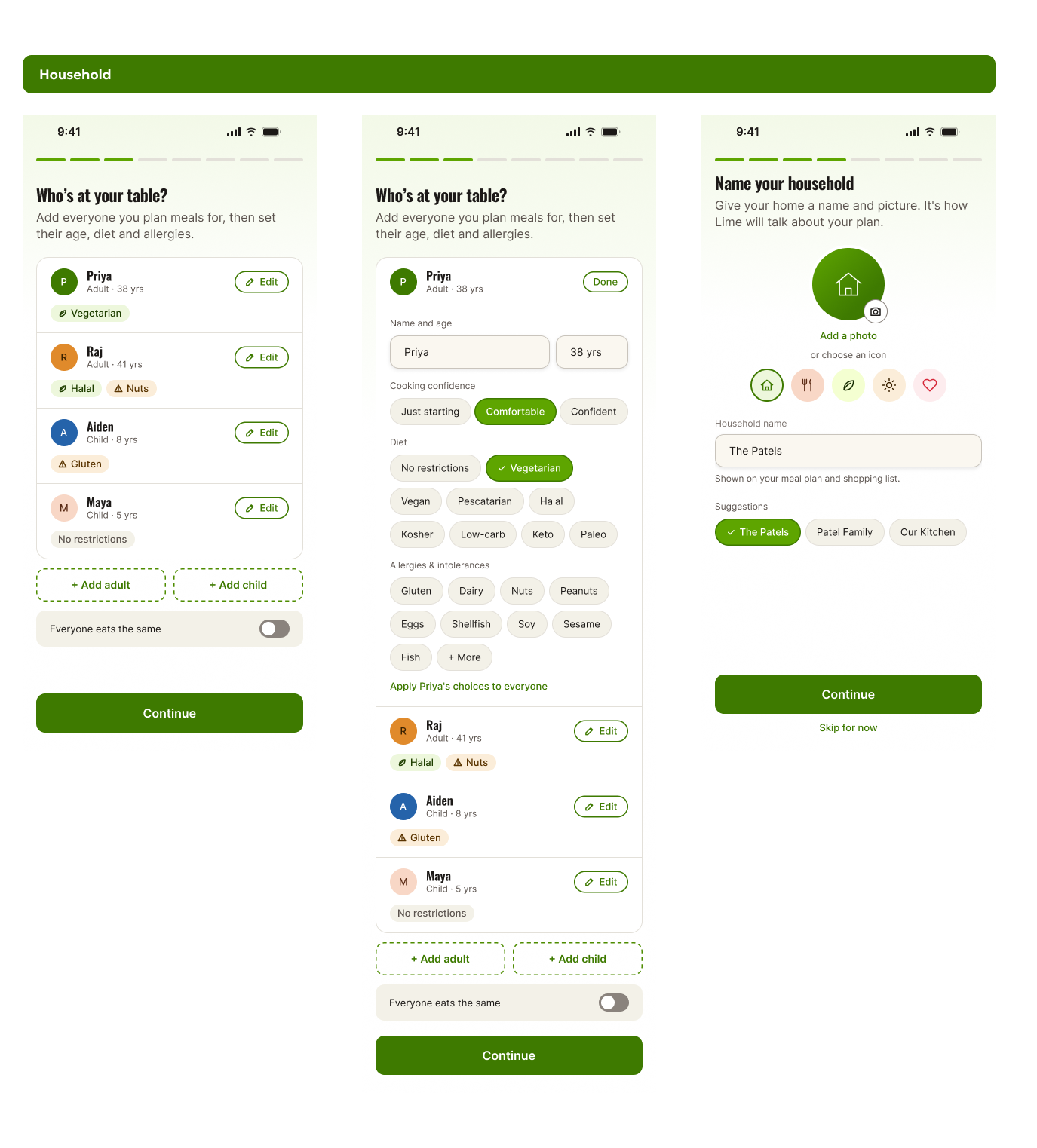
Single-Profile Household Limitation
The Issue: Onboarding forced entire multi-person households into a single merged profile. Couples or families with conflicting diets (e.g., one pescatarian partner and one meat-eater) could not set separate dietary rules or macro targets.
The Fix: Introduced multi-member household profile branching directly during onboarding, allowing planners to set per-person dietary tags, individual calorie/macro targets, and portion sizes under a single shared account.
Viewport Sizing & Mobile Scrolling Friction
The Issue: Onboarding pages opened pre-scrolled or oversized on mobile viewports, forcing users to scroll up just to read section titles.
The Fix: Redesigned step layouts to fit standard mobile viewports, pinning section headings in view while options scroll smoothly underneath.
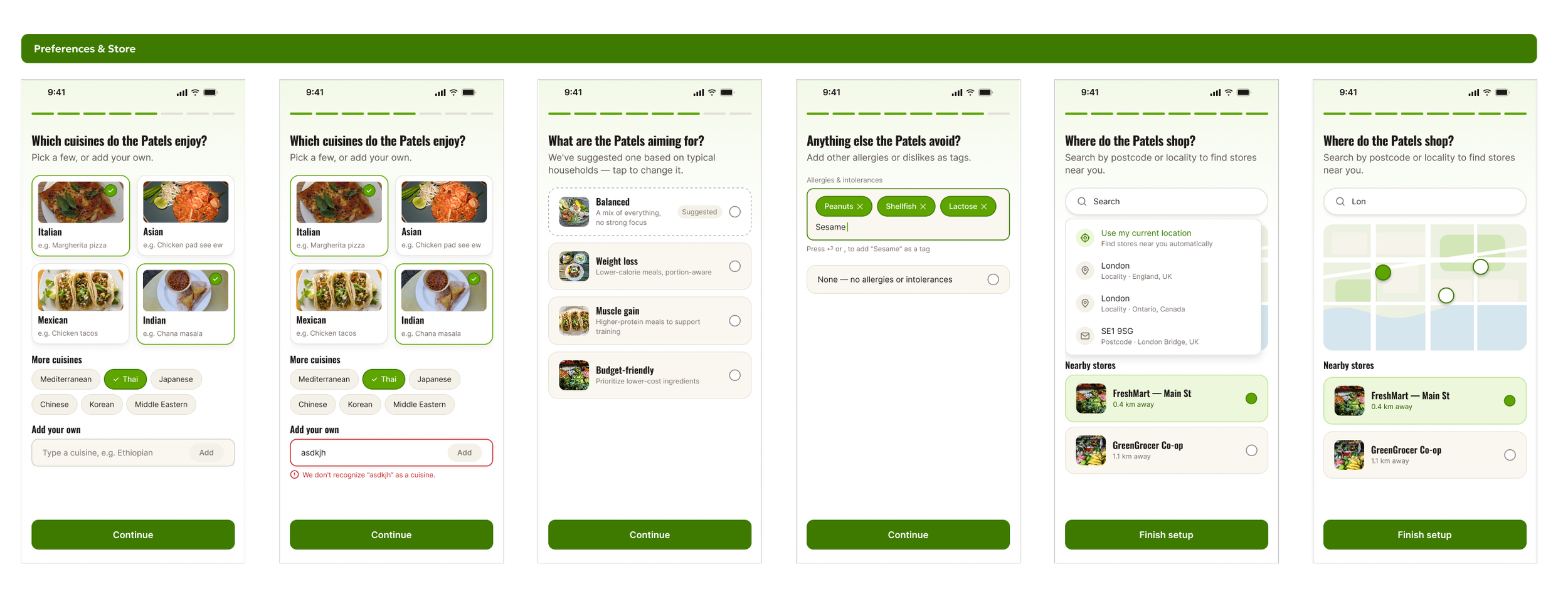
Unfamiliar Cuisine Taxonomy & Ambiguous Inputs
The Issue: Users hesitated on unfamiliar cuisine labels because they lacked example dishes, defaults like "Balanced" looked identical to deliberate user choices.
The Fix: Added representative dish examples/thumbnails under each cuisine label and styled pre-selected defaults distinctly from user selections..
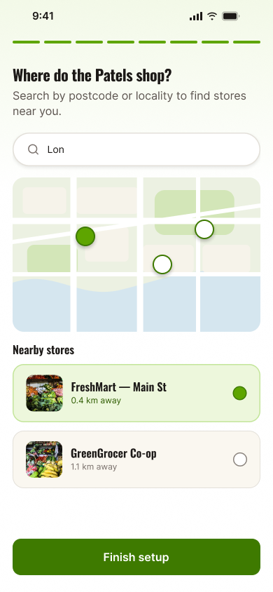
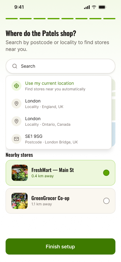
Store Selection & Postal Code Barriers
The Issue: Choosing nearby grocery stores relied strictly on postal codes with no visual map, and the input field rejected non-Canadian zip codes.
The Fix: Integrated an interactive store-picker map and updated the field validation to accept international zip/postal formats
Home & Generation
Existing Screen
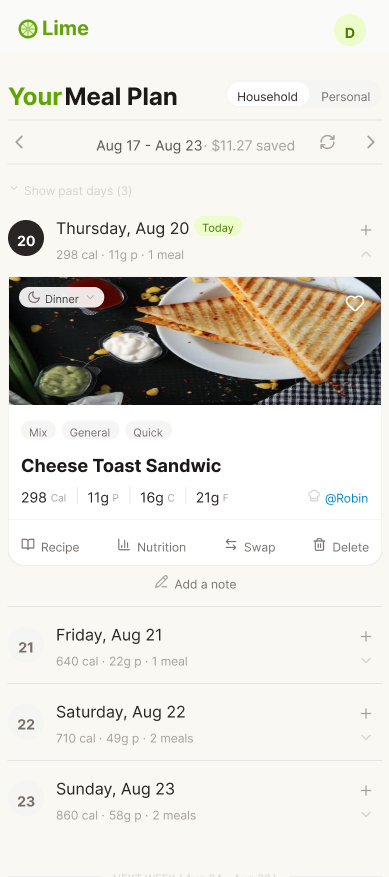
Existing Screen
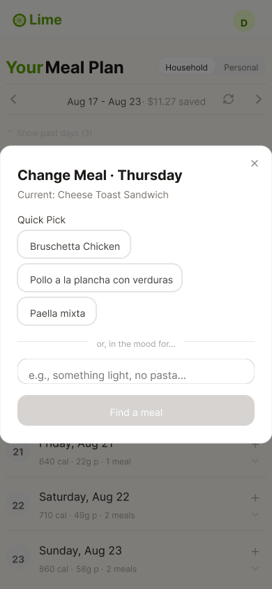
System Latency & Card Image Refresh Lag
The Issue: Swapping a meal caused significant visual confusion and trust breaks. The recipe name updated immediately, but the meal card image took up to a minute to refresh—or failed to change at all—leaving users unsure if the swap succeeded.
The Fix: Implemented instant loading/success feedback states and synced the card image to update in real time upon selecting a new dish.
Broken "Swap" vs. "Delete" Mental Model
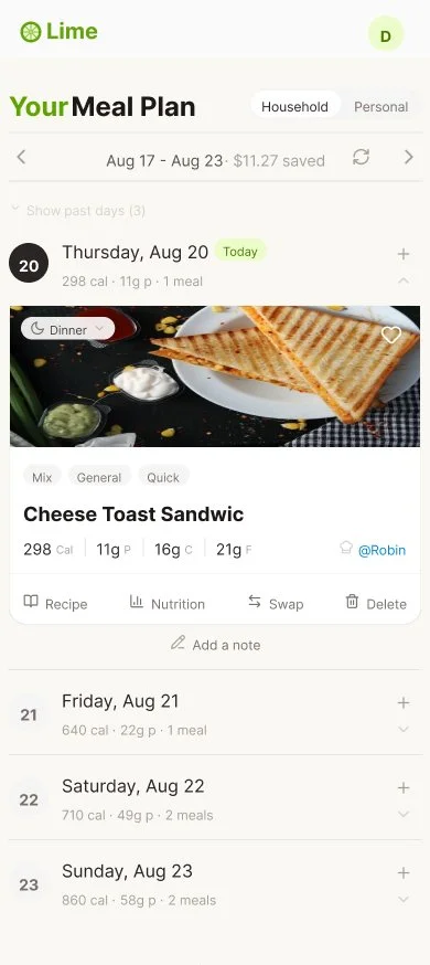
The Issue: Participants clicked the prominent "Delete" button when trying to change a dish because the "Swap" affordance was hidden and undiscoverable. Users expected "Delete" to trigger a meal replacement flow, or worried it would wipe out the entire day's schedule.
The Fix: Explicitly separated "Replace" from "Remove" actions, and surfaced a prominent, dedicated "Swap" button directly on the face of every meal card.
New High-Fidelity Screens
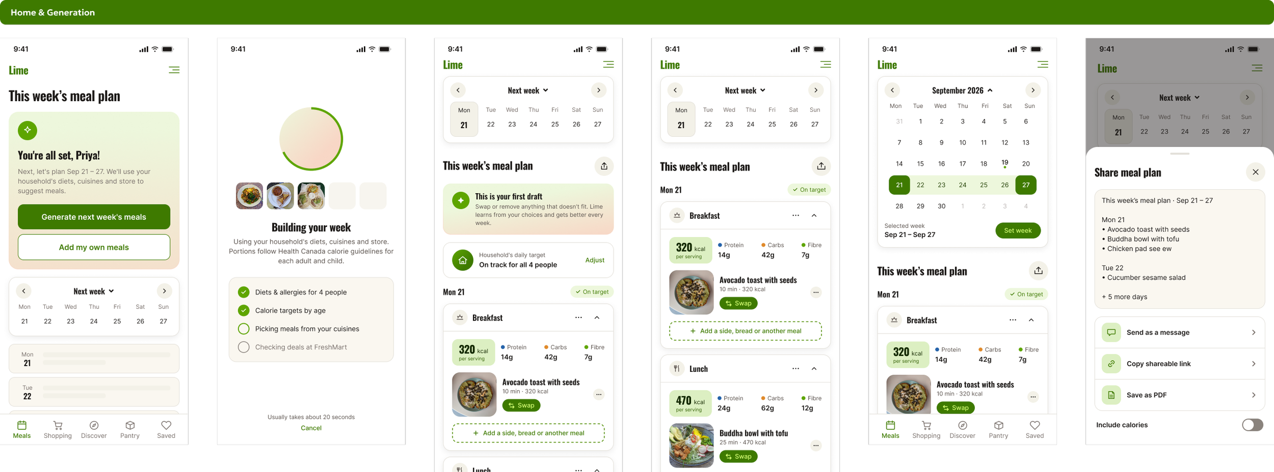
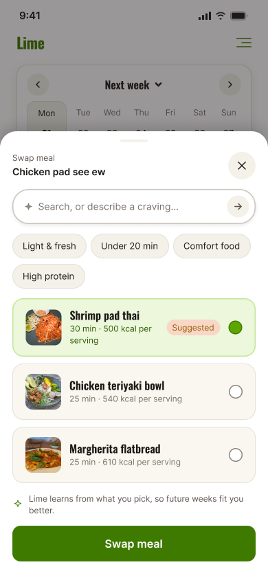
Blind Swapping & Low Recommendation Quality
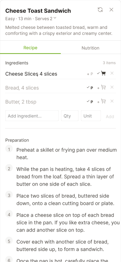
The Issue: Swap suggestions lacked variety (e.g., returning only Mexican dishes when swapping a taco) and failed to display calorie/macro counts on candidate cards. Furthermore, selecting an option committed the swap immediately without letting the user preview ingredients or prep time.
The Fix: Added calorie/macro metrics to swap candidate cards, improved suggestion diversity across cuisine types, and introduced a "Preview before commit" modal.
New Screen
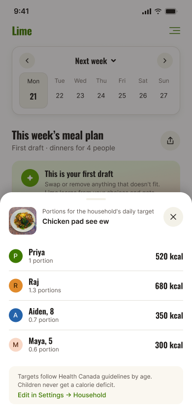
Hidden Household vs. Personal Serving Controls
The Issue: Users struggled to adjust serving counts or find the Household/Personal mode toggle. Planners cooking for families of 5 or 6 were forced into default 2-serving plans that required manual editing for every recipe.
The Fix: Placed an explicit, per-meal serving selector directly on the card interface and linked it to the primary account's household profile settings.
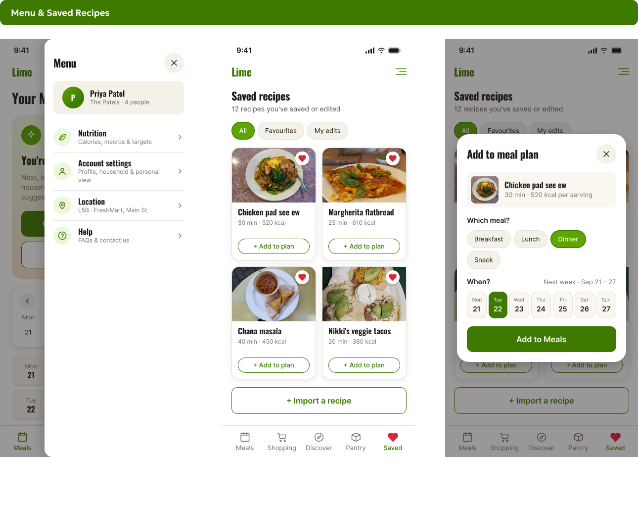
The New "Saved" Page / Recipe Library
The Problem It Solved: Research showed that users naturally discover recipes outside of Lime, saving inspiration on
Pinterest
Instagram
TikTok
YouTube
Users wanted a central hub to bring those external recipes into their weekly planning rotation .
How It Works: Located as a dedicated section in the navigation, the Saved Page acts as the user's personal digital cookbook
Shopping List / Pantry Page
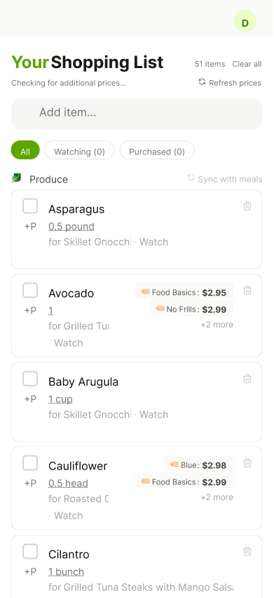
During usability testing, participants encountered major cognitive friction on the Shopping List screen. Users struggled to differentiate what the pantry page purpose was, misread cryptic iconography, and lacked ways to export lists to delivery services or share them with household members.
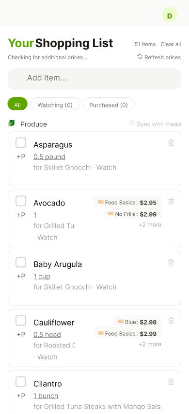
Existing Screen
Compact Photo-Card Layout & Mobile Keyboard UI
The Problem: Text-dense, full-width rows made visual scanning difficult in store aisles, and adding custom items triggered mobile keyboard overlaps that blocked the entry button .
The Fix: Introduced a compact photo-card layout with item thumbnails for quick visual scanning and pinned an inline "Add Item" confirmation bar directly above the mobile keyboard
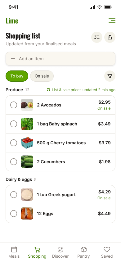
Simplified, and scoped down
Rows use real photos instead of inflated cards; the estimated total moved to the end of the list. In cart and Watchlist are left out of this release nothing in research shows demand, and the states they’d reuse were already confusing testers.